
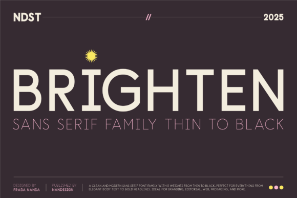
Introducing Brighten Font: Elevating Design with Precision and Intention
Brighten is not just a typeface—it’s a design decision. Built with precision and intention, Brighten is a modern sans serif font family crafted to elevate clarity, beauty, and impact in equal measure. Each letterform was drawn with a deep respect for balance, proportion, and rhythm, resulting in a typeface that feels both timeless and distinctly contemporary.
The Philosophy Behind Brighten
The creation of Brighten font was guided by a clear vision: to develop a typeface that embodies the perfect harmony of form and function. The designers aimed to craft a font that not only stands out in the digital age but also brings a sense of elegance and sophistication to any design project. Whether it’s for a website, a brand identity, or a marketing campaign, Brighten is designed to make a lasting impression.
📸 Preview Images


💡 Click on any image to view full size
Key Features of Brighten Font
Precision and Intention
Every aspect of the Brighten font was meticulously designed with precision and intention. From the careful consideration of letterforms to the meticulous adjustment of spacing and kerning, every detail contributes to the font’s exceptional clarity and readability.
Modern Sans Serif Design
Brighten is a modern sans serif font family that strikes the perfect balance between contemporary aesthetics and timeless elegance. The clean lines, subtle curves, and balanced proportions make it an ideal choice for a wide range of design applications.
Elevated Clarity, Beauty, and Impact
The primary goal of the Brighten font was to elevate the way we experience typography. By focusing on clarity, beauty, and impact, the designers created a typeface that not only communicates effectively but also engages and inspires the audience.
The Design Process: Crafting a Timeless Typeface
The development of Brighten involved a deep dive into the principles of typography and design. The process began with an exploration of the fundamental elements of letterforms, including balance, proportion, and rhythm. Each letter was carefully crafted to ensure that it not only looks aesthetically pleasing but also functions optimally in various contexts.
Applications of Brighten Font
Digital and Print Media
Brighten’s versatility makes it suitable for both digital and print media. Its clear and legible design ensures that it performs exceptionally well in body text, headings, and even large-scale displays.
Branding and Identity
For brands looking to establish a strong visual identity, Brighten offers a range of possibilities. Its modern and sophisticated look can help brands communicate their values and personality effectively.
Web Design and Development
In the realm of web design, Brighten shines as a highly readable and accessible font. Its sans serif design ensures that it remains clear and legible even on smaller screens, making it an excellent choice for responsive web design.
Why Choose Brighten Font?
Exceptional Legibility
Brighten’s design prioritizes legibility, ensuring that your message is communicated clearly and effectively, regardless of the medium.
Versatility
With its range of weights and styles, Brighten is adaptable to various design needs, from elegant headings to body text.
Timeless Aesthetic
Brighten’s classic yet contemporary design ensures that it remains relevant and stylish for years to come, providing a solid foundation for your brand’s visual identity.
Brighten Font: Access Download Now
| Font Name | Brighten Font |
| Author | Unknown |
| Download | Access Download Here |
Conclusion
Brighten font represents a significant advancement in typography, offering a unique blend of precision, beauty, and impact. By choosing Brighten, designers and brands can elevate their visual communication, ensuring that their message is not only seen but also remembered. Whether you’re looking to refresh your brand identity, enhance your website’s readability, or simply explore new typography options, Brighten is an excellent choice.
Getting Started with Brighten Font
Integrating Brighten into your design workflow is straightforward. The font family is available for download and can be easily installed on your computer or accessed through web font services. Once installed, you can start exploring the various weights and styles, experimenting with different combinations to find the perfect fit for your project.
Technical Specifications
| Font Family | Brighten |
|---|---|
| Font Style | Modern Sans Serif |
| Weights | Variable |
| Characters | Extended Latin |
Future of Typography: Trends and Predictions
As we look to the future, typography continues to evolve, influenced by technological advancements, cultural shifts, and changing reader behaviors. Brighten font is at the forefront of this evolution, embodying the qualities that will define typography in the years to come: precision, intention, and a deep respect for the user experience.
