
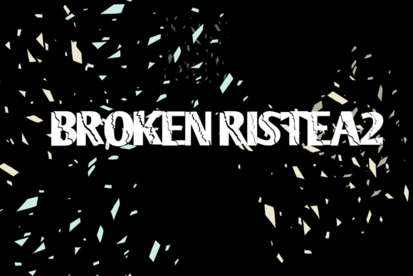
Unleash Your Creativity with Brokenristea2 Font: Elevate Your Billboard Design to the Next Level
In the world of advertising, making a lasting impression is key to capturing the attention of your audience. One of the most effective ways to do this is through eye-catching billboard designs. A crucial element in creating visually stunning billboards is the choice of font. This is where the Brokenristea2 font comes into play. In this article, we’ll explore how this unique font, especially in its second edition, can transform your billboard design and make it stand out like never before.
What is Brokenristea2 Font?
Brokenristea2 font is a distinctive typeface designed to give your text a broken or shattered effect. This font is not just any ordinary font; it’s specifically crafted to add a layer of drama and intrigue to your designs. Whether you’re looking to create a sense of urgency, convey a bold message, or simply make your billboard more visually appealing, Brokenristea2 is the perfect choice.
📸 Preview Images


💡 Click on any image to view full size
This Second Edition of the Broken Effect Font
The second edition of the Brokenristea2 font takes everything that made the original great and elevates it to new heights. This updated version offers even more customization options, improved readability, and a wider range of applications. With the second edition, you’re not just getting a font; you’re getting a tool that can completely transform your design process.
Why Brokenristea2 Font is Perfect for Your Billboard
- Attention-Grabbing: The broken effect of the font naturally draws the eye, making it perfect for billboards that need to stand out in a crowded environment.
- Versatility: It can be used in a variety of contexts, from digital billboards to print media, and even in web design.
- Emotional Impact: The unique aesthetic of the font can evoke emotions and create a memorable experience for viewers.
- Customization: With the second edition, you have more options than ever to tailor the font to your specific design needs.
Tips for Using Brokenristea2 Font Effectively
To get the most out of the Brokenristea2 font, consider the following tips:
- Contrast is Key: Use contrasting colors to make the text pop against the background of your billboard.
- Keep it Simple: While the font itself is eye-catching, ensure that the message is clear and not overwhelmed by too many design elements.
- Experiment with Sizes: The broken effect can be dramatic, so don’t be afraid to experiment with different text sizes to maximize impact.
- Pair Wisely: If you’re using the Brokenristea2 font alongside other typefaces, choose fonts that complement its unique style.
Give it a Try and Create Something Spectacular!
The true potential of the Brokenristea2 font, especially its second edition, can only be realized by experiencing it firsthand. By incorporating this font into your billboard design, you’re not just making a statement; you’re creating an experience. So, don’t hesitate to give it a try. With its help, you’ll be well on your way to creating something truly spectacular.
In conclusion, the Brokenristea2 font, particularly in its second edition, is a game-changer for billboard design. Its unique aesthetic, combined with its versatility and emotional impact, makes it an invaluable tool for designers looking to make a lasting impression. So why settle for ordinary when you can create something extraordinary? Try the Brokenristea2 font today and see the difference it can make.
Brokenristea2 Font: Access Download Now
| Font Name | Brokenristea2 Font |
| Author | Unknown |
| Download | Access Download Here |
