
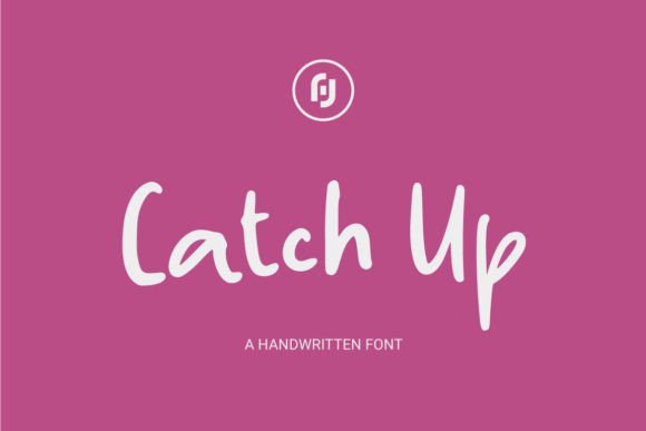
Catch Up Font: A Handwritten Typeface for a Personal Touch
In the world of typography, fonts play a crucial role in conveying the tone and personality of a brand or message. Among the numerous font styles available, handwritten fonts have gained immense popularity for their unique and personal touch. One such font that has caught the attention of designers and typography enthusiasts is the Catch Up font. In this article, we’ll delve into the characteristics, features, and uses of the Catch Up font, exploring what makes it a standout typeface in the world of typography.
What is Catch Up Font?
Catch Up is a handwritten font that exudes a casual, friendly, and inviting aesthetic. Its flowing, organic lines and gentle curves give it a relaxed and approachable feel. The font’s design is inspired by the imperfections and uniqueness of handwritten writing, making it an excellent choice for projects that require a personal touch.
📸 Preview Images


💡 Click on any image to view full size
Key Features of Catch Up Font
The Catch Up font boasts several distinctive features that set it apart from other typefaces. Some of its notable characteristics include:
- Flowing, organic lines: The font’s lines are smooth and fluid, giving it a natural and effortless appearance.
- Gentle curves: The curves in the font are soft and rounded, contributing to its friendly and approachable feel.
- Uneven baseline: The font’s baseline is intentionally uneven, adding to its handwritten appearance and personal touch.
- Slight variations in letterforms: The font features subtle variations in letterforms, making each character unique and contributing to its organic feel.
The Tone of Catch Up Font
The overall tone of the Catch Up font is soft, warm, and nostalgic. Its gentle curves and flowing lines evoke a sense of comfort and familiarity, making it an excellent choice for projects that aim to establish a personal connection with the audience. The font’s warm and inviting aesthetic is perfect for brands that want to convey a sense of friendliness and approachability.
Uses of Catch Up Font
The Catch Up font is versatile and can be used in various design projects, including:
- Branding and logos: The font’s unique and personal touch makes it an excellent choice for branding and logo design.
- Packaging design: The font’s friendly and approachable feel makes it suitable for packaging design, particularly for products that require a personal touch.
- Advertising and marketing materials: The font’s soft and warm tone makes it perfect for advertising and marketing materials, such as brochures, flyers, and posters.
- Digital media: The font’s organic and handwritten appearance makes it suitable for digital media, including social media graphics, blog posts, and website headers.
Benefits of Using Catch Up Font
Using the Catch Up font in design projects offers several benefits, including:
- Unique and personal touch: The font’s handwritten appearance adds a unique and personal touch to design projects.
- Emotional connection: The font’s soft and warm tone helps establish an emotional connection with the audience.
- Versatility: The font is versatile and can be used in various design projects.
- Easy to read: The font is easy to read, making it suitable for body text and headlines.
Tips for Using Catch Up Font Effectively
To get the most out of the Catch Up font, consider the following tips:
- Use it sparingly: Use the font sparingly to avoid overwhelming the audience.
- Pair it with other fonts: Pair the font with other fonts to create contrast and visual interest.
- Adjust the size and color: Adjust the size and color of the font to suit the design project’s requirements.
- Experiment with different styles: Experiment with different styles, such as bold and italic, to add emphasis and create visual hierarchy.
Catch Up Font: Access Download Now
| Font Name | Catch Up Font |
| Author | Unknown |
| Download | Access Download Here |
Conclusion
In conclusion, the Catch Up font is a unique and versatile typeface that offers a personal touch to design projects. Its flowing, organic lines, gentle curves, and uneven baseline make it a standout font in the world of typography. With its soft and warm tone, the font is perfect for brands that want to establish a personal connection with their audience. By using the Catch Up font effectively, designers can create visually appealing and engaging design projects that leave a lasting impression on the audience.
