
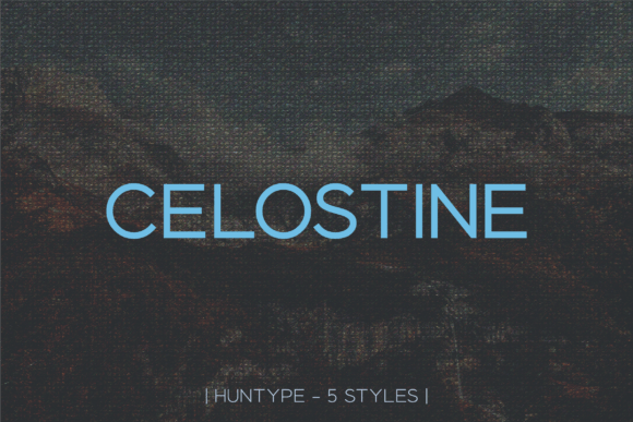
Introducing Celostine Sans Serif Font Family: Elevate Your Designs with Elegance and Versatility
In the world of typography, a well-crafted font can make all the difference in elevating your design to new heights. Meet Celostine Font, a meticulously designed sans serif font family that embodies the perfect blend of elegance, modernity, and versatility. With its five distinct weights, Celostine offers a wide range of creative possibilities, making it an ideal choice for designers and content creators looking to add a touch of sophistication to their projects.
The Celostine Font Family: A Symphony of Weights
At the heart of the Celostine Font Family lies its impressive range of five weights: THIN, LIGHT, REGULAR, BOLD, and BLACK. This diverse collection allows designers to experiment with various styles and tones, ensuring that their message is conveyed with precision and impact. Whether you’re aiming for a subtle and delicate touch or a bold and attention-grabbing statement, Celostine’s got you covered.
📸 Preview Images


💡 Click on any image to view full size
THIN: The Epitome of Subtlety
The THIN weight of Celostine is perfect for designs that require a subtle yet sophisticated touch. Its delicate strokes and airy feel make it an excellent choice for luxury brands, high-end products, or elegant editorials. With Celostine THIN, you can add a touch of refinement to your project without overpowering the content.
LIGHT: A Touch of Sophistication
Building on the subtlety of the THIN weight, Celostine LIGHT adds a hint of warmth and friendliness to your design. This weight is ideal for projects that require a bit more presence without sacrificing elegance. From fashion magazines to upscale restaurant menus, Celostine LIGHT is sure to impress.
REGULAR: The Workhorse of the Family
The REGULAR weight of Celostine strikes the perfect balance between elegance and readability. As the most versatile member of the family, it’s suitable for a wide range of applications, from body text to headings. Whether you’re designing a website, brochure, or social media graphics, Celostine REGULAR is a reliable choice.
BOLD: Making a Statement
When you need to make a statement, Celostine BOLD is the perfect choice. With its confident and assertive presence, this weight is ideal for headlines, titles, and any design element that requires attention-grabbing impact. From advertising campaigns to event branding, Celostine BOLD ensures your message is heard loud and clear.
BLACK: The Ultimate Expression of Strength
For designs that demand maximum impact, Celostine BLACK is the ultimate choice. This weight boasts powerful, commanding presence, making it perfect for dramatic headlines, posters, and any project that requires an authoritative tone. With Celostine BLACK, you can create stunning visual statements that leave a lasting impression.
Why Choose Celostine Font Family?
So, what sets Celostine apart from other font families? Here are just a few reasons why designers and content creators are falling in love with this versatile typeface:
Unparalleled Elegance
Celostine’s sleek, modern design exudes sophistication and refinement, making it perfect for high-end brands, luxury products, and elegant editorials.
Versatility Unmatched
With five distinct weights, Celostine offers an incredible range of creative possibilities, allowing you to experiment with different styles and tones to suit your project’s needs.
Seamless Readability
Celostine’s carefully crafted letterforms ensure exceptional readability, even at smaller sizes, making it perfect for body text and extended reading.
Contemporary Style
Celostine’s modern aesthetic ensures your designs look fresh and up-to-date, perfect for brands and projects that demand a cutting-edge visual identity.
How to Use Celostine Font Family in Your Designs
Ready to elevate your designs with Celostine? Here are some practical tips on incorporating this stunning font family into your workflow:
Pairing with Other Fonts
Experiment with pairing Celostine with other fonts to create visually striking combinations. Its versatility makes it an excellent choice for pairing with both serif and script fonts.
Selecting the Right Weight
Choose the weight that best suits your design’s tone and purpose. For example, use Celostine LIGHT for body text and Celostine BOLD for headlines.
Color Schemes and Branding
Celostine’s elegance shines with a wide range of color schemes. Experiment with monochromatic palettes, soft pastels, or bold brights to find the perfect fit for your brand or project.
Celostine Font: Access Download Now
| Font Name | Celostine Font |
| Author | Unknown |
| Download | Access Download Here |
Conclusion
In conclusion, the Celostine Font Family is a game-changer for designers and content creators seeking to elevate their projects with elegance, modernity, and versatility. With its five distinct weights, seamless readability, and contemporary style, Celostine is poised to become a go-to choice for a wide range of applications. Whether you’re crafting luxury brand experiences, editorial content, or digital products, Celostine Font Family is your key to creating stunning visual statements that leave a lasting impression.
