
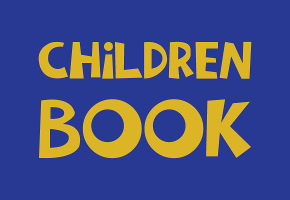
Children Book Font: A Playful Typeface for Young Minds
When it comes to creating engaging and interactive children’s books, the font used can play a significant role in capturing the attention of young readers. A children book font is a typeface designed with a playful and childlike aesthetic, featuring a set of whimsical, cheerful characters that are often reminiscent of handwritten letters or doodles made for children.
What is a Children Book Font?
A children book font is a type of font that is specifically designed for use in children’s literature. It is typically characterized by its playful, fun, and approachable style, which is intended to appeal to young readers. These fonts often feature rounded edges, irregular shapes, and a carefree feel that makes them perfect for use in picture books, early readers, and other children’s literature.
📸 Preview Images


💡 Click on any image to view full size
Key Features of Children Book Fonts
- Playful and whimsical design: Children book fonts are designed to be fun and engaging, with a playful aesthetic that appeals to young readers.
- Rounded edges and irregular shapes: These fonts often feature rounded edges and irregular shapes, which give them a friendly and approachable feel.
- Handwritten or doodle-like style: Many children book fonts are designed to resemble handwritten letters or doodles, which adds to their playful and informal feel.
- Easy to read: Despite their playful design, children book fonts are still highly legible and easy to read, making them perfect for use in children’s literature.
Types of Children Book Fonts
There are many different types of children book fonts available, each with its own unique style and characteristics. Some of the most popular types of children book fonts include:
- Handwritten fonts: These fonts are designed to resemble handwritten letters and are often characterized by their irregular shapes and playful feel.
- Script fonts: Script fonts are designed to resemble cursive handwriting and are often used in children’s literature to add a touch of elegance and sophistication.
- Display fonts: Display fonts are designed to be used in headings and titles, and are often characterized by their bold, playful design.
- Serif fonts: Serif fonts are designed with small lines or flourishes at the ends of the letters, which can add a touch of sophistication and elegance to children’s literature.
Popular Children Book Fonts
Some popular children book fonts include:
- Comic Sans: Comic Sans is a popular font that is often used in children’s literature due to its playful and informal feel.
- Arial Rounded: Arial Rounded is a rounded version of the popular Arial font, and is often used in children’s literature due to its friendly and approachable feel.
- Calibri: Calibri is a modern font that is often used in children’s literature due to its clean and elegant design.
- Pacifico: Pacifico is a beautiful script font that is often used in children’s literature due to its elegant and sophisticated feel.
Tips for Choosing a Children Book Font
When choosing a children book font, there are several factors to consider. Here are a few tips to keep in mind:
- Consider the age group: Different age groups have different needs when it comes to fonts. For example, younger children may benefit from fonts with simpler designs, while older children may be able to read more complex fonts.
- Think about the tone: The font should match the tone of the story. For example, a funny story may benefit from a playful font, while a more serious story may benefit from a more elegant font.
- Make sure it’s legible: The font should be easy to read, even for children who are just learning to read.
- Be consistent: Consistency is key when it comes to fonts. Try to use the same font throughout the book to create a cohesive look.
Best Practices for Using Children Book Fonts
Here are a few best practices to keep in mind when using children book fonts:
- Use a limited number of fonts: Too many fonts can be overwhelming and distracting. Stick to one or two fonts per book.
- Use font sizes wisely: Make sure the font is large enough to be easy to read, but not so large that it overwhelms the page.
- Pay attention to line spacing: Line spacing can make a big difference in readability. Make sure the lines are far enough apart to be easy to read.
- Consider the color scheme: The font color should match the overall color scheme of the book. Avoid using bright or bold colors that may be distracting.
Children Book Font: Access Download Now
| Font Name | Children Book Font |
| Author | Unknown |
| Download | Access Download Here |
Conclusion
In conclusion, a children book font is a typeface designed with a playful and childlike aesthetic, featuring a set of whimsical, cheerful characters that are often reminiscent of handwritten letters or doodles made for children. When choosing a children book font, consider the age group, tone, legibility, and consistency. By following best practices and choosing a font that is fun and engaging, you can create a beautiful and effective children’s book that will capture the attention of young readers.
