
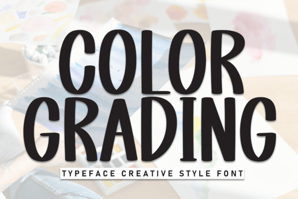
Color Grading Font: Enhancing Visual Appeal and Readability
Color grading font is a crucial aspect of graphic design, which involves adjusting the colors of a font to make it look better and more attractive. This process enhances the visual appeal of the text and makes it easier to read. In this article, we will explore the concept of color grading font, its importance, and how to grade colors for a bold display font.
What is Color Grading Font?
Color grading font refers to the process of adjusting the colors of a font to improve its appearance and make it more visually appealing. This involves changing the shades, brightness, and contrast of the text to ensure it stands out and matches the design. The goal of color grading font is to create a harmonious and aesthetically pleasing visual effect that captures the reader’s attention.
Importance of Color Grading Font
Color grading font is essential in graphic design because it can significantly impact the readability and visual appeal of the text. A well-colored font can make a significant difference in the overall design, making it more engaging and effective. Here are some reasons why color grading font is important:
- Enhances Visual Appeal: Color grading font can make the text look more attractive and visually appealing, which can capture the reader’s attention and make the design more engaging.
- Improves Readability: By adjusting the colors, shades, and contrast of the font, color grading can make the text easier to read, reducing eye strain and improving the overall reading experience.
- Matches Design: Color grading font ensures that the text matches the design and is consistent with the overall visual identity, creating a harmonious and cohesive look.
What Does it Mean to Color Grade a Bold Display Font?
Color grading a bold display font means adjusting the colors of the font to make it look better and more attractive. This involves changing the shades, brightness, and contrast to ensure the text stands out and matches the design. When color grading a bold display font, the goal is to create a visually appealing and attention-grabbing effect that makes the text stand out.
How to Color Grade a Bold Display Font
Color grading a bold display font involves several steps:
- Choose a Color Scheme: Select a color scheme that matches the design and is consistent with the brand’s visual identity.
- Adjust Shades and Brightness: Adjust the shades and brightness of the font to create a visually appealing effect.
- Adjust Contrast: Adjust the contrast of the font to ensure it stands out and is easy to read.
- Experiment with Colors: Experiment with different colors and shades to find the perfect combination that works for the design.
Tips for Effective Color Grading Font
Here are some tips for effective color grading font:
- Use a Limited Color Palette: Use a limited color palette to create a cohesive and harmonious visual effect.
- Consider the Background: Consider the background color and ensure the font color contrasts with it.
- Test for Readability: Test the font for readability and make adjustments as needed.
- Experiment and Iterate: Experiment with different colors and shades, and iterate until you find the perfect combination.
Best Practices for Color Grading Font
Here are some best practices for color grading font:
- Use Color Grading Tools: Use color grading tools, such as Adobe Color, to help you create a visually appealing color scheme.
- Consider Accessibility: Consider accessibility and ensure the font is readable for people with visual impairments.
- Be Consistent: Be consistent with the color scheme and use it throughout the design.
- Keep it Simple: Keep it simple and avoid using too many colors or complex color schemes.
Color Grading Font: Access Download Now
| Font Name | Color Grading Font |
| Author | Unknown |
| Download | Access Download Here |
Conclusion
Color grading font is a crucial aspect of graphic design that can significantly impact the visual appeal and readability of the text. By understanding the importance of color grading font and how to grade colors for a bold display font, designers can create visually appealing and effective designs that capture the reader’s attention. By following the tips and best practices outlined in this article, designers can create stunning color graded fonts that elevate their designs to the next level.
