
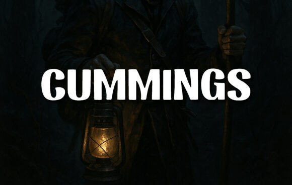
Cummings Font: A Modern Sans-Serif Typeface with a Vintage Twist
The Cummings font is a display typeface that has been gaining popularity in recent times due to its unique blend of modern and vintage design elements. Its bold, rounded block letterforms convey strength without aggression, making it an ideal choice for headlines, posters, and logos. In this article, we will take a closer look at the Cummings font, its design characteristics, and its potential uses.
Design Characteristics
The Cummings font is a sans-serif typeface that stands out with its thick, uniform strokes, which lend a solid and dependable feel to the text. The rounded terminals soften its appearance, striking a balance between authority and friendliness. The consistent stroke width and absence of serifs place it firmly in the modern sans-serif category. However, its proportions and subtle curves echo the charm of vintage Americana design.
📸 Preview Images


💡 Click on any image to view full size
Letters like “M”, “G”, and “U” showcase a carefully constructed symmetry and geometric influence, giving it a clean, grounded rhythm across words. The font’s bold stature demands attention, making it ideal for display purposes. Its design characteristics make it a versatile typeface that can be used in a variety of contexts, from digital media to print materials.
A Nostalgic Warmth
Despite its modern design, the Cummings font has a nostalgic warmth to it, reminiscent of old lantern-lit signs or rustic adventure tales. When paired with moody, textured backgrounds, the font takes on a vintage aesthetic that is both charming and evocative. This nostalgic quality makes it an excellent choice for brands looking to evoke a sense of history or tradition.
The Cummings font’s vintage twist is achieved through its subtle curves and rounded terminals, which give it a softer, more approachable feel. This is in contrast to more traditional sans-serif fonts, which can often feel cold and impersonal. The Cummings font’s unique blend of modern and vintage design elements makes it an attractive choice for designers looking to create a distinctive brand identity.
Uses and Applications
The Cummings font is a versatile typeface that can be used in a variety of contexts. Its bold stature and commanding presence make it ideal for headlines, posters, and logos. However, its clean lines and geometric influence also make it suitable for digital media, such as website headers and social media graphics.
The font’s nostalgic warmth and vintage aesthetic also make it an excellent choice for brands looking to evoke a sense of history or tradition. This could include companies in the food, beverage, or hospitality industries, which often rely on nostalgia and tradition to create a sense of warmth and familiarity.
In addition to its use in branding and advertising, the Cummings font could also be used in editorial design, such as magazines and newspapers. Its clean lines and geometric influence make it easy to read, even at small sizes, while its bold stature and commanding presence make it ideal for headlines and titles.
Typographic Analysis
A typographic analysis of the Cummings font reveals a number of interesting design characteristics. The font’s x-height is relatively high, which gives it a clear and legible appearance. The ascenders and descenders are also well-proportioned, which helps to create a sense of balance and harmony.
The font’s letterforms are also carefully constructed to create a sense of symmetry and geometric influence. Letters like “M” and “W” have a distinctive diagonal slant, which gives them a sense of dynamism and energy. The font’s kerning and spacing are also well-balanced, which helps to create a smooth and even rhythm.
Comparison with Other Fonts
The Cummings font can be compared to other modern sans-serif fonts, such as Helvetica and Arial. However, its unique blend of modern and vintage design elements sets it apart from these more traditional fonts.
In comparison to more traditional serif fonts, such as Times New Roman or Garamond, the Cummings font has a more modern and streamlined appearance. Its clean lines and geometric influence give it a sense of simplicity and elegance, which makes it well-suited for digital media.
The Cummings font can also be compared to other display fonts, such as bold script fonts or ornate serif fonts. However, its bold stature and commanding presence make it more suitable for headlines and titles, while its clean lines and geometric influence make it more versatile and easy to read.
Cummings Font: Access Download Now
| Font Name | Cummings Font |
| Author | Unknown |
| Download | Access Download Here |
Conclusion
In conclusion, the Cummings font is a unique and versatile typeface that offers a blend of modern and vintage design elements. Its bold stature and commanding presence make it ideal for headlines, posters, and logos, while its clean lines and geometric influence make it suitable for digital media.
The font’s nostalgic warmth and vintage aesthetic make it an excellent choice for brands looking to evoke a sense of history or tradition. Its typographic characteristics, such as its high x-height and well-proportioned ascenders and descenders, make it easy to read and visually appealing.
Overall, the Cummings font is a valuable addition to any designer’s toolkit, offering a distinctive and versatile typeface that can be used in a variety of contexts.
