
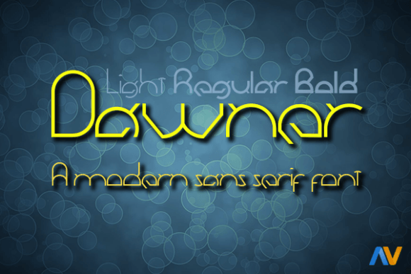
Dawner Font: A Contemporary Sans Serif for Modern Designs
In the realm of typography, few fonts manage to strike a balance between aesthetics and usability. However, the Dawner font, crafted by innovative designer Alberto Villanueva, stands out as a beacon of modernity and versatility. This meticulously designed contemporary sans serif font is not just a typeface; it’s a tool for designers to express their creativity across various mediums.
Key Features of Dawner Font
- Three Distinctive Weights: Dawner offers three weights – Light, Regular, and Bold – allowing designers to play with hierarchy and emphasis in their work.
- Cross-Media Compatibility: The font comes with web fonts and vector formats, making it suitable for both print and digital media.
- Modern Aesthetic: With its clean lines and sans serif design, Dawner brings a modern, striking clarity to any design project.
The Mind Behind Dawner: Alberto Villanueva
Alberto Villanueva, the creative force behind Dawner, is known for his innovative approach to typeface design. With Dawner, Villanueva aimed to create a font that not only embodies the essence of modern design but also offers practicality and flexibility. His work on Dawner showcases his deep understanding of typographic needs in both print and digital media.
📸 Preview Images


💡 Click on any image to view full size
Exploring the Versatility of Dawner
Dawner’s design ensures it can be used in a multitude of projects, from editorials to digital platforms. Here are a few ideas on how to utilize Dawner:
- Minimal Website Design: Dawner’s Light weight is perfect for body text, providing readability without overpowering the layout.
- Bold Editorial Design: The Bold weight of Dawner can be used to create striking headlines that capture attention and make a statement.
- Branding: The Regular weight offers a balanced look suitable for logos and brand names that seek a modern yet approachable feel.
Tips for Using Dawner Effectively
To get the most out of Dawner, consider the following typography tips:
- Mix and Match Weights: Combine different weights to create visual hierarchy. For instance, use the Bold weight for headings and the Light weight for body text.
- Pay Attention to Line Height: Especially in digital media, ensure adequate line height for readability.
- Experiment with Colors: While Dawner’s design is clean and minimal, adding a pop of color can enhance its aesthetic appeal.
Dawner Font: Access Download Now
| Font Name | Dawner Font |
| Author | Unknown |
| Download | Access Download Here |
Conclusion
Dawner font, designed by Alberto Villanueva, is a testament to modern design principles combined with usability. Its range of weights, compatibility with various media, and aesthetic appeal make it an excellent choice for designers looking to leave a mark. Whether your project demands subtlety or boldness, Dawner stands ready to elevate your design to new heights.
Additional Resources
For those interested in exploring more about Dawner or looking to download the font for their projects, here are some additional resources:
- Official Download Link: Download Dawner Font
- Alberto Villanueva’s Portfolio: Visit Alberto’s Portfolio
- Typography Inspiration: Typography Inspiration Board
