
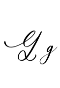
Introducing Gradefully Beauttina Font: The Epitome of Elegance and Charm
In the world of typography, few fonts have managed to capture the essence of elegance and charm as effectively as Gradefully Beauttina. This dazzling script font has been turning heads with its graceful flourishes and intricate details, making it a popular choice for a wide range of design projects. From wedding invitations to branding and signage, Gradefully Beauttina is the perfect addition to any designer’s toolkit.
The Timeless Appeal of Gradefully Beauttina
One of the key features that sets Gradefully Beauttina apart from other script fonts is its timeless appeal. Unlike some fonts that may look trendy or dated after a few years, Gradefully Beauttina has a classic quality that ensures it will remain stylish and relevant for years to come. Its delicate curves and sweeping flourishes evoke a sense of nostalgia and romance, making it perfect for designs that require a touch of sophistication and elegance.
📸 Preview Images


💡 Click on any image to view full size
The Perfect Font for Wedding Invitations
Wedding invitations are one of the most popular uses for Gradefully Beauttina, and it’s easy to see why. The font’s elegant script and intricate details make it perfect for formal wedding invitations, while its delicate curves and flourishes add a touch of romance and whimsy. Whether you’re designing a traditional wedding invitation or something more modern and avant-garde, Gradefully Beauttina is the perfect choice.
In addition to its aesthetic appeal, Gradefully Beauttina is also highly legible, making it easy for guests to read and understand the details of the wedding invitation. This is especially important for wedding invitations, which often include important information such as date, time, and location.
Elevate Your Branding with Gradefully Beauttina
Gradefully Beauttina is not just limited to wedding invitations; it’s also a great choice for branding and advertising. The font’s elegant script and sophisticated curves make it perfect for luxury brands, high-end products, and premium services. Whether you’re designing a logo, brochure, or website, Gradefully Beauttina can help elevate your brand and make it stand out from the competition.
One of the key benefits of using Gradefully Beauttina for branding is its versatility. The font can be used in a variety of contexts, from headlines and titles to body copy and taglines. Its legibility and clarity make it easy to read, even at small sizes, making it perfect for use on business cards, letterheads, and other marketing materials.
Adding a Touch of Sophistication to Signage
Signage is another area where Gradefully Beauttina excels. The font’s bold, sweeping curves and intricate details make it perfect for eye-catching signs and displays. Whether you’re designing a storefront sign, a directional sign, or a promotional display, Gradefully Beauttina can help grab attention and make a lasting impression.
One of the key benefits of using Gradefully Beauttina for signage is its ability to stand out in a crowded environment. The font’s unique curves and flourishes make it highly distinctive, ensuring that your sign or display will be noticed and remembered.
The Design Features of Gradefully Beauttina
So what makes Gradefully Beauttina so special? The font features a range of design elements that make it both elegant and versatile. Some of its key features include:
- Graceful flourishes: Gradefully Beauttina features beautiful, sweeping flourishes that add a touch of elegance and sophistication to any design.
- Intricate details: The font’s intricate details, such as its delicate curves and subtle swashes, make it perfect for designs that require a high level of craftsmanship and attention to detail.
- Timeless appeal: Gradefully Beauttina has a classic quality that ensures it will remain stylish and relevant for years to come.
- High legibility: Despite its intricate details, Gradefully Beauttina is highly legible, making it easy to read and understand.
Tips for Using Gradefully Beauttina
Here are a few tips for using Gradefully Beauttina in your designs:
- Use it sparingly: While Gradefully Beauttina is a beautiful font, it can be overwhelming if used too much. Use it sparingly to add a touch of elegance and sophistication to your design.
- Experiment with different sizes: Gradefully Beauttina can be used at a variety of sizes, from large headlines to small body copy. Experiment with different sizes to see what works best for your design.
- Pair it with a simple font: To create visual interest, pair Gradefully Beauttina with a simple font, such as a sans-serif or serif font.
Gradefully Beauttina Font: Access Download Now
| Font Name | Gradefully Beauttina Font |
| Author | Unknown |
| Download | Access Download Here |
Conclusion
Gradefully Beauttina is a truly special font that offers a unique combination of elegance, charm, and versatility. Whether you’re designing a wedding invitation, branding materials, or signage, Gradefully Beauttina is the perfect choice. Its timeless appeal, delicate curves, and intricate details make it a font that will elevate any design project and leave a lasting impression.
