
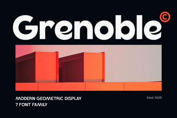
Grenoble Font: A Sleek and Modern Sans-Serif for Your Design Needs
Grenoble Font is a contemporary sans-serif typeface that brings together the best of modern design with classic inspiration. This font family is characterized by its clean lines, sharp angles, and refreshing simplicity, making it an excellent choice for a wide range of design projects. In this article, we’ll explore the features and benefits of Grenoble Font, and how it can elevate your designs to the next level.
Design Characteristics of Grenoble Font
Grenoble Font is a neo-grotesk typeface that draws inspiration from the classic fonts of the 20th century. Its design is marked by a minimal stroke contrast and geometric forms, giving it a contemporary and timeless feel. The font’s strong, structured shapes and large x-height make it highly legible, even at smaller sizes.
📸 Preview Images


💡 Click on any image to view full size
One of the standout features of Grenoble Font is its sleek and modern aesthetic. The font’s clean lines and sharp angles give it a cutting-edge look that’s perfect for designs that require a professional touch. At the same time, its classic inspiration ensures that it remains approachable and easy to read.
Versatility of Grenoble Font
Grenoble Font is an incredibly versatile typeface that can be used in a wide range of design projects. Its modern aesthetic makes it perfect for magazine layouts, digital interfaces, and advertising campaigns. The font’s adaptability also makes it ideal for use in business materials, websites, and packaging designs.
Whether you’re working on a branding project, designing posters, or creating packaging materials, Grenoble Font is an excellent choice. Its bold character makes it perfect for headlines, logos, and signage, while its legibility ensures that your message is communicated clearly and effectively.
Benefits of Using Grenoble Font
There are many benefits to using Grenoble Font in your designs. Here are just a few:
- Improved Legibility: Grenoble Font’s large x-height and clean lines make it highly legible, even at smaller sizes.
- Modern Aesthetic: The font’s sleek and modern design makes it perfect for designs that require a professional touch.
- Versatility: Grenoble Font can be used in a wide range of design projects, from magazine layouts to digital interfaces.
- Timeless Feel: The font’s classic inspiration ensures that it remains approachable and easy to read, even as design trends evolve.
Using Grenoble Font in Your Designs
Grenoble Font is easy to use and can be incorporated into your designs in a variety of ways. Here are a few tips for getting the most out of this versatile typeface:
- Pair it with Other Fonts: Grenoble Font works well when paired with other sans-serif fonts, such as Arial or Helvetica.
- Use it for Headlines: The font’s bold character makes it perfect for headlines and titles.
- Experiment with Different Sizes: Grenoble Font is highly legible at a range of sizes, making it perfect for use in both body text and headlines.
Grenoble Font: Access Download Now
| Font Name | Grenoble Font |
| Author | Unknown |
| Download | Access Download Here |
Conclusion
Grenoble Font is a sleek and modern sans-serif typeface that’s perfect for a wide range of design projects. Its clean lines, sharp angles, and refreshing simplicity make it an excellent choice for designs that require a professional touch. With its versatility, legibility, and timeless feel, Grenoble Font is an excellent addition to any designer’s toolkit.
Frequently Asked Questions
- What is Grenoble Font? Grenoble Font is a modern sans-serif typeface that combines clean lines, sharp angles, and a refreshing simplicity.
- What is Grenoble Font used for? Grenoble Font can be used in a wide range of design projects, including magazine layouts, digital interfaces, branding, posters, and packaging designs.
- Is Grenoble Font legible? Yes, Grenoble Font is highly legible, even at smaller sizes, thanks to its large x-height and clean lines.
Specification of Grenoble Font
- Font Family: Grenoble
- Font Style: Sans-Serif
- Font Weight: Light, Regular, Medium, Bold
- Glyphs: OpenType features
