
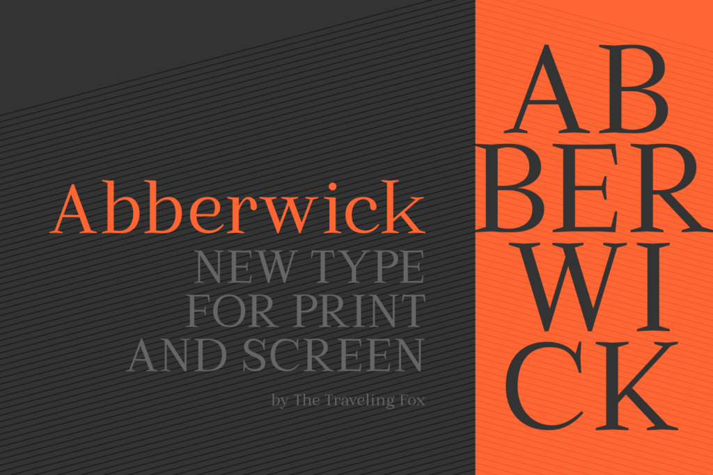
Abberwick Font: A Timeless Serif with a Modern Twist
In the world of typography, few fonts manage to strike a balance between classic elegance and modern flair. Abberwick Font is one such typeface that effortlessly merges traditional serif characteristics with a contemporary touch, making it an exceptional choice for both print and digital design. This article delves into the features, benefits, and applications of Abberwick Font, highlighting its versatility, legibility, and extensive language support.
The Essence of Abberwick Font
Abberwick Font is described as a classically gorgeous serif with a modern touch. This description aptly captures the font’s unique blend of traditional and contemporary elements. The classic serif features provide a sense of timelessness and elegance, while the modern touch injects a fresh and dynamic feel. This combination makes Abberwick Font suitable for a wide range of design applications, from editorial and advertising to digital media and branding.
📸 Preview Images


💡 Click on any image to view full size
Expressive and Legible
One of the standout qualities of Abberwick Font is its expressiveness and legibility. The font’s design ensures that it remains clear and readable even at smaller sizes, making it ideal for body text. At the same time, its detailed features allow it to shine as a headline or title, providing a versatile solution for designers. This balance of expressiveness and legibility is a significant advantage, as it allows designers to use Abberwick Font across various design elements without compromising on aesthetics or readability.
Versatility in Design Applications
Abberwick Font’s versatility is one of its most compelling attributes. It works exceptionally well in both print and digital design, catering to a broad spectrum of creative projects. In print design, Abberwick Font can elevate editorial content, such as newspapers, magazines, and books, with its classic yet modern appeal. In digital design, it can enhance user interfaces, websites, and mobile applications, providing a professional and engaging visual experience.
Detailed Features and Glyph Support
Abberwick Font boasts detailed features that make it stunning as a headline or title. However, what sets it apart is how these details seamlessly blend with the base of the character, ensuring that it also works great as small body text. This harmonious integration of intricate details and simplicity makes Abberwick Font highly adaptable across different design contexts.
In addition to its aesthetic qualities, Abberwick Font offers extensive glyph and language support. The font features a large range of glyphs and supports numerous languages, making it an excellent choice for global brands and multilingual publications. This extensive support not only enhances the font’s versatility but also makes it a practical solution for designers working on international projects.
Benefits for Designers and Brands
The unique combination of classic and modern elements, along with its versatility and extensive language support, makes Abberwick Font a valuable asset for designers and brands. Here are some benefits of using Abberwick Font:
- Consistency Across Platforms: Abberwick Font’s legibility and aesthetic appeal ensure consistency across various platforms, from print materials to digital interfaces.
- Enhanced Readability: The font’s design prioritizes readability, making it easier for audiences to engage with content, whether in headlines or body text.
- Language Support: With support for a large range of glyphs and languages, Abberwick Font is ideal for projects requiring multilingual typography.
- Timeless Appeal: The classic serif elements ensure that Abberwick Font remains relevant and stylish, avoiding the trend-based lifecycle of some contemporary fonts.
Best Practices for Using Abberwick Font
To maximize the potential of Abberwick Font, consider the following best practices:
- Pairing: Experiment with pairing Abberwick Font with complementary fonts to create visual hierarchy and contrast.
- Hierarchy: Utilize the font’s detailed features to establish a clear visual hierarchy, making headlines and titles stand out while maintaining readability in body text.
- Color: Choose color schemes that enhance the font’s classic and modern qualities, ensuring legibility and aesthetic appeal.
- Size and Weight: Take advantage of Abberwick Font’s versatility by using different sizes and weights to create emphasis and distinction across your design.
Abberwick Font: Access Download Now
| Font Name | Abberwick Font |
| Author | Unknown |
| Download | Access Download Here |
Conclusion
Abberwick Font represents a harmonious blend of classic serifs and modern design sensibilities, making it a valuable addition to any designer’s typographic arsenal. Its expressiveness, legibility, and extensive language support position it as a versatile and practical choice for a wide range of design applications. Whether for print or digital media, Abberwick Font offers a timeless appeal that can elevate the visual impact and readability of content. As designers continue to seek typography that combines elegance with functionality, Abberwick Font stands out as an exceptional option that meets and exceeds these expectations.
