
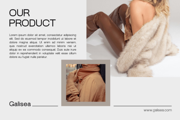
Introducing Ague Font: The Epitome of Modern Typography
In the realm of typography, the right font can make all the difference in the aesthetic and effectiveness of a design. Among the myriad of typefaces available, Ague stands out as a beacon of modernity and versatility. This sleek sans serif typeface family is meticulously crafted to bring a contemporary flourish to a wide array of design genres, making it an indispensable tool for designers seeking to infuse their creations with sophistication and adaptability.
The Design Philosophy Behind Ague
Ague’s design is rooted in a deep understanding of what makes a typeface both functional and aesthetically pleasing. It boasts a comprehensive range of 9 progressive weights, from the delicate ‘Thin’ to the commanding ‘Black’. Each weight is accompanied by an italic variant, ensuring that designers have a wealth of options at their disposal to achieve the perfect typographic balance. This extensive range allows Ague to seamlessly adapt to various design requirements, whether it’s for brand styling, editorial layouts, user interface/user experience (UI/UX) design, or corporate presentations.
📸 Preview Images


💡 Click on any image to view full size
Key Features of Ague Font
- Versatility Across Weights and Styles: With 9 weights and their corresponding italic versions, Ague offers an impressive range of typographic expressions. This versatility ensures that designers can maintain visual consistency across different applications while experimenting with various weights and styles to convey their message effectively.
- Equilibrium of Proportions: Ague’s design strikes a perfect balance between form and function. Its proportions are carefully considered to ensure readability and aesthetic appeal, making it suitable for both body text and headlines.
- Razor-Sharp Contours and Pared-Down Details: The font’s crisp contours and minimalist details contribute to its modern look. These features not only enhance readability, especially in digital formats, but also lend a sleekness that is hard to achieve with more ornate typefaces.
Applications of Ague Font
Ague’s adaptability and aesthetic qualities make it an excellent choice for a variety of design applications:
- Brand Styling: For brands looking to establish a strong visual identity, Ague offers the sophistication and flexibility needed to craft a compelling brand narrative across different platforms.
- Publications and Editorial Layouts: Its readability and range of weights make Ague ideal for editorial design, allowing for the creation of engaging and well-structured textual layouts.
- UI/UX Design: In the realm of digital design, Ague’s clarity and modernity shine, making it a valuable asset for UI/UX designers aiming to create intuitive and visually appealing interfaces.
- Corporate Demonstrations: For businesses looking to make a strong impression, Ague’s robust weights, particularly the ‘Black’ variant, offer a impactful way to convey messages with confidence and authority.
The Impact of Ague Across Different Mediums
One of Ague’s most significant advantages is its ability to maintain its design integrity across various mediums. Whether it’s displayed on a printed canvas or a backlit screen, Ague projects a blend of clarity and elegance. This consistency is crucial in today’s multi-channel world, where brands need to ensure their messaging is coherent and effective across all platforms.
Ague Font: Access Download Now
| Font Name | Ague Font |
| Author | Unknown |
| Download | Access Download Here |
Conclusion
Ague font represents a significant advancement in typography, offering designers a tool that combines versatility, modernity, and sophistication. Its extensive range of weights and styles, coupled with its razor-sharp contours and balanced proportions, make it an ideal choice for a wide range of design applications. As the world of design continues to evolve, having access to typefaces like Ague that can adapt and thrive across different genres and mediums is invaluable. Whether you’re a seasoned designer or just starting out, Ague is a font that can help elevate your designs to new heights of aesthetic appeal and functional effectiveness.
Technical Specifications of Ague Font
- Typeface Family: Ague
- Weights: 9 weights (Thin to Black)
- Styles: Includes italic variants for each weight
- Glyphs: Comprehensive character set including support for multiple languages
- Formats: Available in various formats for print and digital use
Where to Find Ague Font
Ague font can be found on various font repositories and design marketplaces. When purchasing or downloading Ague, ensure you are obtaining it from a reputable source to guarantee authenticity and access to any available updates or support.
Tips for Using Ague Effectively
- Experiment with Weights: Don’t be afraid to experiment with the different weights of Ague to find the perfect balance for your design.
- Pair with Complementary Fonts: When pairing Ague with other fonts, choose typefaces that complement its modern and sleek aesthetic.
- Consider Readability: While Ague is designed for both print and digital use, ensure that the chosen weight and size are readable across different devices and mediums.
