
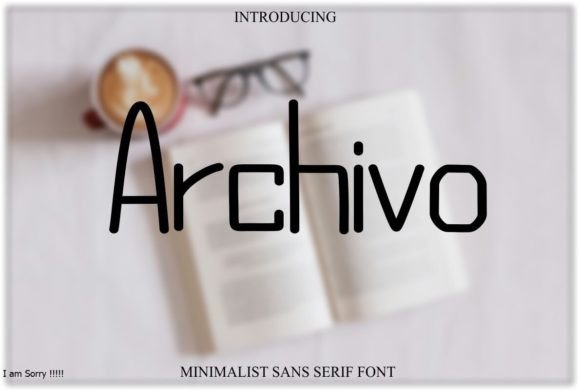
Archivo Font: A Versatile Sans-Serif Font for Digital and Print Media
In the world of typography, fonts play a crucial role in conveying messages, expressing emotions, and creating visual identities. With the rise of digital media, the demand for fonts that are highly legible and adaptable to various platforms has increased. This is where Archivo Font comes into play. Designed with clean, geometric forms and strong, legible letterforms, Archivo is a versatile sans-serif font family that excels in both digital and print media.
What is Archivo Font?
Archivo is a sans-serif font family that boasts a modern and professional appearance, making it suitable for a wide range of applications. Its design focuses on high readability, ensuring that text remains clear and comprehensible across different mediums, from digital screens to print materials. The font’s geometric forms provide a clean and minimalist aesthetic, which is both timeless and versatile.
📸 Preview Images


💡 Click on any image to view full size
Key Features of Archivo Font
- Clean and Geometric Forms: Archivo’s design is characterized by its clean lines and geometric shapes, which contribute to its modern and professional look.
- High Readability: The font is optimized for readability in both digital and print media, making it an excellent choice for body text and headlines.
- Versatility: Archivo’s adaptability allows it to be used in various contexts, from corporate branding and advertising to editorial design and digital interfaces.
- Legible Letterforms: The font’s letterforms are designed to be strong and legible, ensuring that text remains clear even at small sizes.
Applications of Archivo Font
Archivo’s versatility makes it an ideal choice for a wide range of applications, including:
- Digital Media: Archivo is well-suited for digital platforms, including websites, mobile apps, and social media. Its clean design and high readability ensure that text remains clear on various screen sizes and resolutions.
- Print Media: The font’s strong letterforms and geometric shapes make it an excellent choice for print materials, such as brochures, posters, and business cards.
- Branding and Advertising: Archivo’s modern and professional appearance makes it a popular choice for corporate branding and advertising campaigns.
- Editorial Design: The font’s legibility and versatility make it suitable for editorial design, including magazines, newspapers, and books.
Typographic Characteristics of Archivo Font
Archivo’s design is influenced by its typographic characteristics, which include:
- x-Height: The font’s x-height is carefully designed to ensure optimal readability, particularly in digital media.
- Letter Spacing: Archivo’s letter spacing is optimized for both digital and print media, ensuring that text remains clear and legible.
- Weight Variations: The font family includes multiple weight variations, allowing designers to use Archivo for both headlines and body text.
Comparison with Other Fonts
Archivo is often compared to other popular sans-serif fonts, such as Helvetica, Arial, and Open Sans. While these fonts share similarities with Archivo, they have distinct differences in terms of design and typographic characteristics.
- Helvetica: Helvetica is a classic sans-serif font known for its clean design and high readability. While Archivo shares similarities with Helvetica, its geometric forms and strong letterforms give it a unique appearance.
- Arial: Arial is another popular sans-serif font that is often used in digital and print media. Archivo’s design is more geometric and modern compared to Arial, making it a better choice for contemporary designs.
- Open Sans: Open Sans is a popular sans-serif font designed for digital media. While it shares similarities with Archivo in terms of readability, Archivo’s design is more versatile and adaptable to various applications.
Best Practices for Using Archivo Font
To get the most out of Archivo, follow these best practices:
- Choose the Right Weight: Select the appropriate weight variation of Archivo for your design, depending on the context and intended use.
- Adjust Letter Spacing: Adjust the letter spacing to optimize readability, particularly in digital media.
- Use for Both Headlines and Body Text: Take advantage of Archivo’s versatility by using it for both headlines and body text.
In conclusion, Archivo Font is a versatile sans-serif font family that excels in both digital and print media. Its clean, geometric forms and strong, legible letterforms make it an ideal choice for various applications, from branding and advertising to editorial design and digital interfaces. By understanding its key features, typographic characteristics, and best practices for use, designers can harness the full potential of Archivo to create visually appealing and effective designs.
Archivo Font: Access Download Now
| Font Name | Archivo Font |
| Author | Unknown |
| Download | Access Download Here |
