
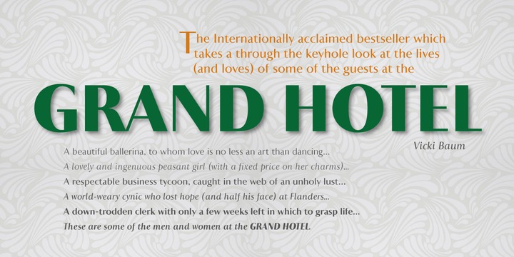
Astoria Classic Sans Family Font: Elevate Your Typography with Elegance and Versatility
The world of typography is vast and diverse, with numerous font families designed to cater to various needs and tastes. Among these, the Astoria range stands out for its elegance and versatility. The latest addition to this esteemed range is the Astoria Classic Sans Family Font, which brings a fresh perspective to the table with its unique characteristics and design philosophy. In this article, we’ll delve into the features, benefits, and applications of the Astoria Classic Sans font, exploring how it can elevate your typographic endeavors.
Introduction to Astoria Classic Sans
Astoria Classic Sans is a sans-serif font family that shares the basic characteristics of its counterpart, Astoria, but with a distinctive twist: vertical stress. This feature sets it apart and gives it a unique personality that is both modern and classic. Designed specifically as a text face, Astoria Classic Sans proves to be incredibly versatile, working well not only in body text but also in headlines, making it a valuable addition to any designer’s or typographer’s toolkit.
Key Characteristics of Astoria Classic Sans
Vertical Stress: A Distinctive Feature
One of the defining features of Astoria Classic Sans is its vertical stress. Unlike traditional sans-serif fonts that might lack a distinct axis, Astoria Classic Sans incorporates vertical stress, giving it a subtle elegance reminiscent of serif fonts. This characteristic makes it highly legible and aesthetically pleasing, suitable for a wide range of applications.
Old Style Yet Modern Italics
Astoria Classic Sans’s italics are formed in an old-style manner, which sets them apart from the more contemporary, slanted italics commonly found in sans-serif fonts. However, these italics are executed with a modern look, ensuring they remain fresh and relevant. This blend of traditional and modern elements makes Astoria Classic Sans’s italics both unique and highly readable.
Designed for Versatility
Originally designed as a text face, Astoria Classic Sans excels in body text, offering excellent readability and flow. However, its capabilities extend far beyond, as it also performs exceptionally well in headlines and titles. Its versatility makes it an ideal choice for various projects, from editorial design and branding to digital interfaces and advertising.
Benefits of Using Astoria Classic Sans
Elegance and Readability
Astoria Classic Sans brings a level of elegance and sophistication to any project. Its design ensures high readability, even at smaller sizes, making it perfect for lengthy texts. At larger sizes, it shines in headlines, offering a crisp and clear presentation that captures attention.
Consistency Across Platforms
In today’s digital age, consistency across various platforms is crucial. Astoria Classic Sans, with its comprehensive range of weights and styles, ensures that your typography remains consistent, whether on the web, in print, or on digital devices.
Creative Freedom
The versatility of Astoria Classic Sans provides designers with a high degree of creative freedom. Whether you’re working on a minimalist project that requires subtlety or a bold campaign that needs to make a statement, Astoria Classic Sans can adapt to your needs, offering the perfect balance of form and function.
Applications of Astoria Classic Sans
Editorial Design
In editorial design, such as in magazines, newspapers, and books, Astoria Classic Sans shines with its readability and aesthetic appeal. Its range of weights allows for a flexible hierarchy of information, making it easier to guide readers through the content.
Branding and Corporate Identity
For branding and corporate identity projects, Astoria Classic Sans offers a professional and elegant look. Its distinctive characteristics can help brands stand out, conveying a sense of tradition and reliability while still appearing modern and forward-thinking.
Digital Interfaces
In digital interfaces, including websites and apps, Astoria Classic Sans performs exceptionally well. Its clear and legible design ensures a pleasant user experience, making it suitable for both headings and body text.
Astoria Classic Sans Family Font: Access Download Now
| Font Name | Astoria Classic Sans Family Font |
| Author | Unknown |
| Download | Access Download Here |
Conclusion
Astoria Classic Sans Family Font represents a significant addition to the Astoria range, offering a unique blend of classic elements with a modern twist. Its vertical stress, elegant design, and versatile nature make it an excellent choice for a wide range of typographic projects. Whether you’re a designer looking for a reliable and aesthetically pleasing font for your next project or a typographer interested in exploring new creative avenues, Astoria Classic Sans is definitely worth considering. With its exceptional readability, beautiful aesthetics, and flexibility across different applications, Astoria Classic Sans is poised to become a favorite in the world of typography.
