
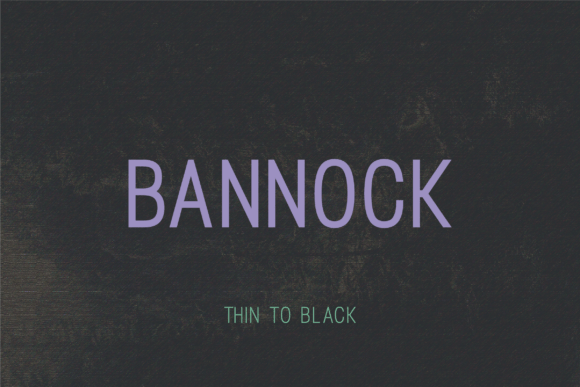
Bannock Font: A Modern and Versatile Typeface for Diverse Design Needs
The Bannock font family is a modern and versatile typeface that seamlessly blends clean geometric forms with subtle sophistication. Its adaptable style makes it an ideal choice for a wide range of design applications, from commanding headlines to refined, minimalist designs. In this article, we’ll explore the features and benefits of the Bannock font family, and examine its various weights and uses.
A Harmonious Blend of Sharp Lines and Gentle Curves
The Bannock font family is characterized by its precise letterforms and contemporary aesthetic, which is achieved through a harmonious blend of sharp lines and gentle curves. This balance of contrasting elements gives Bannock its unique and sophisticated appearance, making it suitable for a variety of design contexts. Whether you’re looking to create bold and impactful headlines or subtle, elegant text, Bannock has a weight to suit your needs.
📸 Preview Images


💡 Click on any image to view full size
The Bannock Font Family: Five Weights for Diverse Applications
The Bannock font family consists of five distinct weights: Thin, Light, Regular, Bold, and Black. Each weight offers a unique character and versatility, allowing designers to choose the perfect font for their specific design requirements.
Bannock Black: Bold and Impactful for Commanding Headlines
Bannock Black is the boldest and most impactful member of the Bannock font family. With its strong and commanding presence, it’s perfect for headlines, titles, and key messages that demand attention. Its bold and assertive style makes it an excellent choice for designers looking to create a lasting impression.
Bannock Bold: Strong and Persuasive for Key Messages
Bannock Bold is a strong and persuasive font that’s ideal for key messages, subheadings, and other design elements that require a sense of authority and conviction. Its bold style is both confident and elegant, making it suitable for a wide range of design applications.
Bannock Regular: A Balanced and Versatile Mid-Weight
Bannock Regular is the mid-weight font in the Bannock family, offering a balanced and versatile style that’s suitable for diverse design applications. Its clean and elegant appearance makes it perfect for body text, articles, and other written content that requires a clear and readable font.
Bannock Light: Subtle and Elegant for Refined Designs
Bannock Light is a subtle and elegant font that’s designed for refined designs that require a minimalist touch. Its delicate and sophisticated style makes it perfect for luxury brands, high-end products, and other design applications where a sense of elegance and sophistication is paramount.
Bannock Thin: Delicate and Sophisticated for a Minimalist Touch
Bannock Thin is the lightest and most delicate member of the Bannock font family. Its subtle and sophisticated style makes it perfect for designs that require a minimalist touch, such as luxury brands, fashion labels, and other high-end products. Its delicate appearance adds a touch of elegance and refinement to any design.
Key Features and Benefits of the Bannock Font Family
The Bannock font family offers a range of key features and benefits that make it an attractive choice for designers. Some of its key features include:
- Clean geometric forms: Bannock’s clean geometric forms give it a modern and sophisticated appearance that’s perfect for a wide range of design applications.
- Subtle sophistication: Bannock’s subtle sophistication makes it suitable for refined designs that require a touch of elegance and refinement.
- Adaptable style: Bannock’s adaptable style makes it perfect for a wide range of design applications, from commanding headlines to subtle, elegant text.
- Five distinct weights: Bannock’s five distinct weights offer designers a range of choices for different design applications, from bold and impactful headlines to subtle, elegant text.
Best Practices for Using the Bannock Font Family
To get the most out of the Bannock font family, here are some best practices to keep in mind:
- Choose the right weight: Choose the right weight of Bannock font for your design application. For example, Bannock Black is perfect for commanding headlines, while Bannock Light is better suited for subtle, elegant text.
- Use contrast effectively: Use contrast effectively by pairing different weights of Bannock font to create visual interest and hierarchy in your design.
- Consider legibility: Consider legibility when using Bannock font, particularly in body text and other written content. Make sure the font size and style are clear and readable.
Bannock Font: Access Download Now
| Font Name | Bannock Font |
| Author | Unknown |
| Download | Access Download Here |
Conclusion
The Bannock font family is a modern and versatile typeface that offers a range of benefits and features for designers. Its clean geometric forms, subtle sophistication, and adaptable style make it perfect for a wide range of design applications, from commanding headlines to subtle, elegant text. With its five distinct weights, Bannock font offers designers a range of choices for different design applications, making it an excellent addition to any design project.
