
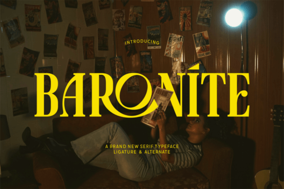
Introducing Baronite Font: The Epitome of Theatrical Flair and Vintage Sophistication
In the realm of typography, few fonts manage to convey the perfect blend of drama, elegance, and sophistication. Baronite Font, however, stands out as a remarkable exception. This bold serif typeface is meticulously designed to radiate an aura of theatrical flair and vintage sophistication, making it an ideal choice for designers seeking to add a touch of grandeur to their creations.
The Design Elements of Baronite Font
At the heart of Baronite’s dramatic presence are its high-contrast strokes, artful ligatures, and stylish alternates. These design elements work in harmony to create a visually striking effect that commands attention.
📸 Preview Images

💡 Click on any image to view full size
- High-Contrast Strokes: The pronounced contrast between thick and thin strokes in Baronite Font lends it a sense of dynamism and elegance. This feature is particularly effective in headlines and titles, where it adds a level of sophistication and refinement.
- Artful Ligatures: Ligatures are an essential aspect of typographic design, and Baronite Font incorporates them with flair. These artful connections between letters not only enhance the aesthetic appeal of the text but also contribute to its readability.
- Stylish Alternates: The availability of stylish alternates allows designers to introduce variations into their text, adding a layer of depth and creativity to their designs. This feature is especially useful in editorial layouts and branding projects, where differentiation is key.
Applications of Baronite Font
Given its distinctive characteristics, Baronite Font is remarkably versatile and can be effectively utilized in a variety of design applications.
- Posters: For posters, Baronite Font offers a powerful way to grab the viewer’s attention. Its bold, theatrical quality makes it perfect for titles and headlines that need to stand out.
- Headlines: In editorial design, headlines are crucial for capturing the reader’s interest. Baronite’s high-contrast strokes and elegant ligatures make it an excellent choice for headlines, adding a touch of sophistication to any article or feature.
- Editorial Layouts: Beyond headlines, Baronite Font can be used throughout editorial layouts to create a cohesive and stylish look. Its readability and aesthetic appeal make it suitable for body text, especially in publications that aim to convey a sense of luxury or creativity.
- Branding: For brands looking to establish a distinctive identity, Baronite Font offers a unique solution. Its blend of theatricality and sophistication can help brands stand out and convey their message with elegance and impact.
The Impact of Baronite Font on Design
The introduction of Baronite Font into a design project can have a transformative effect, elevating the overall aesthetic and emotional impact of the work.
- Emotional Connection: Typography plays a crucial role in creating an emotional connection with the audience. Baronite Font, with its bold and elegant presence, can evoke feelings of grandeur, sophistication, and creativity.
- Visual Hierarchy: Establishing a clear visual hierarchy is essential in design. Baronite Font aids in this process by providing a clear distinction between headings, subheadings, and body text, ensuring that the viewer is guided smoothly through the content.
- Brand Differentiation: In a crowded marketplace, differentiation is key. By incorporating Baronite Font into their branding, companies can create a distinctive visual identity that sets them apart from competitors.
Best Practices for Using Baronite Font
To maximize the impact of Baronite Font, it’s essential to follow best practices in typography and design.
- Legibility: Ensure that the chosen font size and line spacing provide adequate legibility. Despite its elegance, Baronite Font should remain readable, especially in longer texts.
- Contrast: Utilize the high-contrast strokes of Baronite Font to create visual interest. Pairing it with simpler fonts can enhance readability and add depth to the design.
- Hierarchy: Employ Baronite Font in a way that establishes a clear visual hierarchy. Use size variations, weights, and styles to guide the viewer’s eye through the content.
Baronite Font: Access Download Now
| Font Name | Baronite Font |
| Author | Unknown |
| Download | Access Download Here |
Conclusion
Baronite Font stands as a testament to the power of typography in design. Its bold, serif structure, combined with high-contrast strokes, artful ligatures, and stylish alternates, makes it a versatile and impactful choice for a wide range of applications. Whether used in posters, headlines, editorial layouts, or branding, Baronite Font brings a sense of grandeur and creativity that can elevate any design project. By incorporating Baronite into their work, designers can create visually stunning and emotionally resonant pieces that command attention and leave a lasting impression.
