
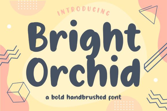
Bright Orchid Font: Add a Touch of Whimsy to Your Designs
The world of typography is vast and diverse, offering a multitude of font styles to suit various design needs. Among these, the Bright Orchid font stands out for its unique blend of cuteness and boldness, making it an excellent choice for projects aimed at children or those requiring a playful touch. In this article, we’ll delve into the characteristics of the Bright Orchid font, explore its uses, and provide insights on how to integrate it into your designs effectively.
What is Bright Orchid Font?
Bright Orchid is described as a cute and bold display font. Its childlike playfulness is the defining feature that sets it apart from more traditional or formal fonts. This playful nature makes it an ideal candidate for projects such as kids’ books, school projects, posters, and any design that could benefit from a youthful and vibrant feel.
📸 Preview Images


💡 Click on any image to view full size
Key Characteristics:
- Cute and Bold: The font combines cuteness with boldness, making it easily readable and attention-grabbing.
- Childlike Playfulness: Its playful design evokes a sense of fun and innocence, perfect for targeting a younger audience.
- Display Font: Designed primarily for display purposes, it excels in headlines, titles, and short texts.
Uses of Bright Orchid Font
The versatility of the Bright Orchid font, despite its specific design for display purposes, allows it to be used in a variety of contexts. Here are some of the most suitable applications:
1. Kids and School Projects
Its playful and childlike nature makes it perfect for:
- Kids’ book covers and interiors
- School posters and announcements
- Educational materials aimed at children
2. Marketing and Advertising
For marketing campaigns targeting children or young families:
- Product packaging for kids’ products
- Advertisements in children’s magazines or websites
- Promotional materials for family-friendly events
3. Digital Content
In the digital realm:
- Blog posts about parenting, education, or kids’ activities
- Social media posts targeting young families
- Websites for children’s services or products
How to Use Bright Orchid Font Effectively
To make the most of the Bright Orchid font, consider the following tips:
1. Pair with Complementary Fonts
For better readability and aesthetic balance, pair Bright Orchid with simpler fonts for body text. Fonts with a clean and sans-serif design work well.
2. Adjust Size and Color
Given its bold nature, ensure that the font size and color are chosen to match the hierarchy of your design. Bright colors can enhance its playful feel.
3. Use Sparingly
While it’s tempting to use Bright Orchid throughout your design, its impact is strongest when used sparingly for titles or key messages.
Bright Orchid Font: Access Download Now
| Font Name | Bright Orchid Font |
| Author | Unknown |
| Download | Access Download Here |
Conclusion
Bright Orchid font offers a unique opportunity to add a playful and bold touch to your designs. Its childlike charm and versatility make it suitable for a variety of projects, from educational materials to marketing campaigns targeting young families. By understanding its characteristics and using it effectively, designers can create visually appealing and engaging content that stands out.
So, why not give Bright Orchid a try in your next project? Its ability to brighten up any design with its playful and bold personality is sure to leave a lasting impression on your audience.
