
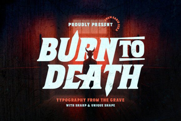
Burn to Death Typeface: A Sharp Wedge-Serif Horror Display Font
The Burntodeath Regular Font is a bold and menacing typeface that is sure to make a statement in any design project. With its sharp wedge-serif design and heavy, condensed serif skeleton, this font is perfect for creating eye-catching headlines and titles that demand attention. In this article, we’ll take a closer look at the Burn to Death Typeface and explore its features, uses, and benefits.
Design and Features
The Burn to Death Font is a carefully crafted typeface that pushes a heavy, condensed serif skeleton into jagged, blade-like terminals and skewed cuts. This design gives every letter a carved, menacing feel that is sure to send chills down the spine. The font features triangular spurs, flared stems, and exaggerated overshoots that create a sense of motion and energy.
📸 Preview Images


💡 Click on any image to view full size
One of the standout features of the Burn to Death Typeface is its texture, which reads like scorched metal or stone. This texture gives the font a unique and rugged feel that is perfect for horror-themed designs, such as posters, game covers, and album art.
Uses and Applications
The Burntodeath Regular Font is a versatile typeface that can be used in a variety of design projects, including:
- Horror posters and flyers
- Game covers and packaging
- Album art and music branding
- Halloween-themed designs and decorations
- Dark and edgy branding and advertising
When using the Burn to Death Typeface, it’s best to set it in all caps with tight tracking and generous line spacing. This will help to create a bold and dramatic effect that is sure to grab attention. For body copy, it’s recommended to use a neutral sans or slab font to preserve legibility.
Styling and Effects
To get the most out of the Burntodeath Regular Font, try pairing it with gritty overlays, wide drop shadows, or red-to-orange “ember” gradients. These effects will help to enhance the font’s sharp angles and unique silhouettes, creating a visual hook that is sure to draw the eye.
When using the Burn to Death Typeface, it’s also important to consider the background color and contrast. The font thrives on dark backgrounds with high contrast, which helps to create a dramatic and eye-catching effect.
Benefits and Advantages
The Burntodeath Regular Font offers a number of benefits and advantages, including:
- Unique and bold design that demands attention
- Perfect for horror-themed designs and dark branding
- Versatile and can be used in a variety of design projects
- Easy to read and legible, even at large sizes
- Can be paired with a range of effects and styles to enhance its impact
Burntodeath Regular Font: Access Download Now
| Font Name | Burntodeath Regular Font |
| Author | Unknown |
| Download | Access Download Here |
Conclusion
The Burntodeath Regular Font is a powerful and menacing typeface that is sure to make a statement in any design project. With its sharp wedge-serif design, heavy condensed serif skeleton, and jagged terminals, this font is perfect for creating eye-catching headlines and titles that demand attention. Whether you’re designing a horror poster, game cover, or album art, the Burn to Death Typeface is a great choice.
Font Specifications
- Font Family: Burn to Death
- Font Style: Regular
- Font Weight: Bold
- Font Type: Digital
- Glyphs: 220+
- Formats: OTF, TTF, WOFF
Frequently Asked Questions
- What is the Burn to Death Typeface?
- The Burn to Death Typeface is a sharp wedge-serif horror display font that is perfect for creating eye-catching headlines and titles.
- What is the best way to use the Burntodeath Regular Font?
- The best way to use the Burntodeath Regular Font is to set it in all caps with tight tracking and generous line spacing, and to pair it with a neutral sans or slab font for body copy.
- Can I use the Burn to Death Typeface for commercial projects?
- Yes, the Burn to Death Typeface is licensed for commercial use, and can be used in a variety of design projects, including horror posters, game covers, and album art.
