
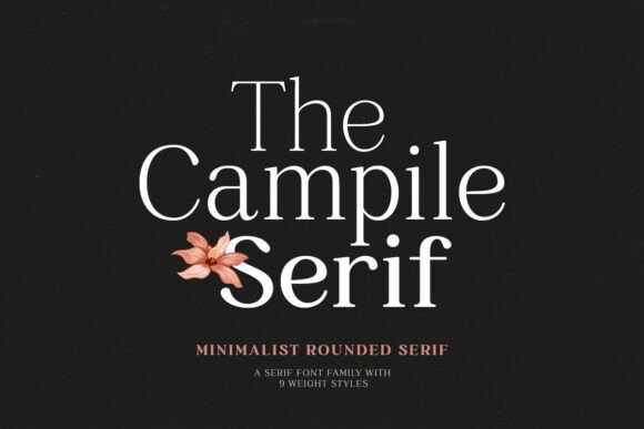
Campile Font: Elevate Your Design with Stylish and Minimalist Looks
In the world of typography, fonts play a crucial role in conveying the tone and aesthetic of a design project. With numerous font options available, finding the perfect one that balances style and functionality can be a daunting task. However, if you’re looking for a font that exudes elegance and sophistication, look no further than Campile Font. In this article, we’ll explore the features and benefits of Campile Font, a rounded serif font family that is sure to elevate your design to the next level.
What is Campile Font?
Campile Font is a carefully crafted rounded serif font family designed to provide a stylish and minimalist look to your design projects. With its smooth and rounded edges, Campile Font offers a unique blend of modernity and classic elegance. The font family consists of 9 weights, ranging from Thin to Black, allowing you to choose the perfect weight to suit your project’s needs.
- Thin
- Extra Light
- Light
- Regular
- Medium
- Semi Bold
- Bold
- Extra Bold
- Black
The variety of weights in Campile Font makes it an incredibly versatile font, suitable for a wide range of design applications, from clean and minimalist designs to bold and attention-grabbing projects.
Design Possibilities with Campile Font
One of the standout features of Campile Font is its flexibility. The font’s various weights can be used to create stunning visual hierarchies, adding depth and dimension to your design. Here are a few design possibilities to explore:
Clean and Minimalist Looks
For designs that require a clean and minimalist aesthetic, the Light and Regular weights of Campile Font are ideal. These weights provide a subtle and understated look, perfect for projects that require a sophisticated and elegant feel.
Strong Impressions
On the other hand, if you want to make a bold statement, the Bold and Extra Bold weights of Campile Font are sure to deliver. These weights are perfect for headlines, titles, and other design elements that require attention-grabbing typography.
Combining Weight Styles
One of the most exciting features of Campile Font is the ability to combine different weight styles to create visually stunning designs. By mixing and matching the various weights, you can create a unique visual hierarchy that adds depth and interest to your design.
Example: Creating a Stunning Visual Hierarchy
Here’s an example of how you can use Campile Font to create a stunning visual hierarchy:
- Use the Light weight for body text to provide a clean and readable base.
- Use the Medium weight for subheadings to add a touch of elegance and sophistication.
- Use the Bold weight for headings to create a bold and attention-grabbing effect.
By combining the different weights of Campile Font, you can create a visually stunning design that engages and captivates your audience.
Multi-Language Support
In today’s globalized world, designing for a diverse audience is crucial. Campile Font understands this need and provides multi-language support, making it an excellent choice for projects that require typography in multiple languages.
Whether you’re designing for a global audience or simply want to future-proof your design, Campile Font’s multi-language support has got you covered.
Tips and Tricks for Using Campile Font
Here are a few tips and tricks to help you get the most out of Campile Font:
Experiment with Different Weights
Don’t be afraid to experiment with different weights of Campile Font to find the perfect combination for your design.
Pay Attention to Line Height and Spacing
Make sure to adjust the line height and spacing to ensure that your text is readable and visually appealing.
Use Campile Font for Headings and Body Text
Campile Font is versatile enough to be used for both headings and body text. Experiment with different weights and sizes to create a visually stunning design.
Campile Font: Access Download Now
| Font Name | Campile Font |
| Author | Unknown |
| Download | Access Download Here |
Conclusion
In conclusion, Campile Font is an exceptional rounded serif font family that offers a stylish and minimalist look to your design projects. With its 9 weights, multi-language support, and versatility, Campile Font is an excellent choice for designers looking to elevate their design to the next level.
Whether you’re designing for a clean and minimalist aesthetic or a bold and attention-grabbing effect, Campile Font has got you covered. So why wait? Explore the possibilities of Campile Font today and take your design to new heights!
