
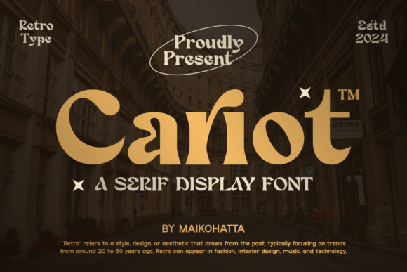
Cariot Font: Elevate Your Typography with a Touch of Modern Sophistication
In the realm of typography, the right font can make all the difference in communicating your message effectively. Whether you’re designing a logo, crafting a brand identity, or simply looking to elevate your written content, the choice of font is paramount. Introducing Cariot, a new serif display font that embodies the perfect balance of modernity and readability. With its distinctive characteristics and versatile design, Cariot is poised to become an indispensable asset in your typographic arsenal.
The Essence of Cariot Font
Cariot is a thoughtfully crafted serif display font that boasts a balanced proportion of stroke thickness and fineness. This deliberate design choice results in visuals that are not only attractive but also effortlessly readable. The modern serif style of Cariot is marked by a bold distinction between thick and thin lines, imbuing it with a touch that is at once understated and attention-grabbing.
📸 Preview Images


💡 Click on any image to view full size
The hallmark of Cariot lies in its ability to strike a balance between being unobtrusive and standing out. This makes it an ideal choice for a wide range of applications, from editorial design and advertising to branding and digital content creation. The font’s versatility stems from its unique blend of classic serif elements and modern sensibilities, making it suitable for projects that demand a bit of sophistication and flair.
Design Characteristics of Cariot
Cariot’s design is characterized by several key features that set it apart from other serif fonts:
- Balanced Stroke Thickness: The font exhibits a well-balanced distribution of stroke thickness, which contributes to its readability and aesthetic appeal.
- Distinctive Contrast: The bold distinction between thick and thin lines adds a layer of sophistication and elegance to the font, making it perfect for headlines and display text.
- Modern Serif Style: Cariot’s serif style is deeply rooted in modern typographic principles, ensuring it remains relevant and impactful in various design contexts.
- Ease of Readability: Despite its stylized appearance, Cariot prioritizes readability, making it an excellent choice for body text and longer passages.
Applications of Cariot Font
The versatility of Cariot font makes it suitable for a myriad of applications across different design disciplines:
- Branding and Logo Design: Cariot’s unique blend of modernity and tradition makes it an excellent choice for brands looking to establish a strong and memorable visual identity.
- Editorial Design: For magazines, newspapers, and digital publications, Cariot offers a sophisticated solution for headlines and body text, enhancing the overall reading experience.
- Advertising: The font’s ability to stand out, combined with its readability, makes it perfect for ad copy, posters, and billboards.
- Digital Content: Cariot can elevate digital content, including website headers, blog posts, and social media graphics, adding a touch of elegance and professionalism.
Why Choose Cariot?
In a sea of typography options, Cariot stands out for several reasons:
- Unique Aesthetic: Cariot offers a distinctive look that can help differentiate your brand or design from the competition.
- Versatility: Its adaptability across various design contexts makes Cariot a valuable asset for any designer or brand.
- Readability: The font’s focus on readability ensures that your message is conveyed effectively, whether in print or digital formats.
- Modern Appeal: Cariot’s modern serif style ensures it remains contemporary and relevant, even as design trends evolve.
Cariot Font: Access Download Now
| Font Name | Cariot Font |
| Author | Unknown |
| Download | Access Download Here |
Conclusion
Cariot font represents a significant addition to the world of typography, offering a perfect blend of modern sophistication and readability. Its balanced design, distinctive contrast, and versatile nature make it an ideal choice for a wide range of applications. Whether you’re a designer looking to elevate your projects or a brand aiming to establish a strong visual identity, Cariot is poised to meet your typographic needs. Embrace the elegance and modernity of Cariot, and discover a new way to communicate your message with style and impact.
Getting Started with Cariot
Integrating Cariot into your design workflow is straightforward:
- Download Cariot: Acquire the font files from a reputable source.
- Install: Follow the installation instructions for your operating system or design software.
- Experiment: Play around with Cariot in different contexts to fully appreciate its versatility.
- Apply: Use Cariot in your designs, enjoying its aesthetic appeal and functional benefits.
