
Chalk Scratches Rough Font: Unleashing the Raw, Hand-Drawn Charm
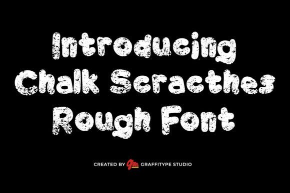
In the world of typography, few fonts manage to capture the essence of hand-drawn authenticity as effectively as the Chalk Scratches Rough Font. This unique typeface brings to mind the nostalgic feel of chalk scribbles on a dusty blackboard, evoking memories of classroom doodles and the raw creativity of street art. With its rough edges, uneven strokes, and distressed details, Chalk Scratches Rough Font exudes an organic and spontaneous character that is perfect for designs aiming to feel authentic, bold, and handmade.
The Inspiration Behind Chalk Scratches Rough Font
The inspiration for Chalk Scratches Rough Font lies in its name. Imagine the sensation of chalk scraping against a blackboard, leaving behind a trail of white, smudged marks. This font captures that tactile experience, translating it into a digital format that can be used across various platforms. The result is a typeface that doesn’t just look like it was drawn with chalk—it feels like it was.
📸 Preview Images


💡 Click on any image to view full size
The rough, textured quality of this font is reminiscent of traditional blackboard lettering, often seen in classrooms, street signage, and informal art. This connection to physical, hands-on creativity gives Chalk Scratches Rough Font a distinctive character that sets it apart from more polished, digital typefaces.
Key Features of Chalk Scratches Rough Font
- Rough Edges and Uneven Strokes: The font’s edges are intentionally rough and uneven, mimicking the natural inconsistencies of hand-drawn chalk lines. This variability adds a layer of authenticity and personality to the text.
- Distressed Details: The font includes distressed details such as smudges, cracks, and slight discoloration, further enhancing its realistic, chalk-like appearance.
- Organic and Spontaneous Character: The overall feel of Chalk Scratches Rough Font is organic and spontaneous. It looks like it was created in the moment, making it perfect for designs that need to convey a sense of immediacy and creativity.
- High Visual Impact: The bold presence of this font ensures it stands out, making it ideal for headlines, posters, and any design that requires attention-grabbing typography.
Best Use Cases for Chalk Scratches Rough Font
Chalk Scratches Rough Font is primarily designed for display purposes, making it perfect for projects where typography needs to be bold and impactful. Here are some of the best use cases for this versatile font:
- Headlines and Titles: Use Chalk Scratches Rough Font to create eye-catching headlines in newspapers, magazines, websites, and social media posts. Its bold presence ensures that the text doesn’t go unnoticed.
- Posters and Flyers: Whether promoting an event, product, or service, this font adds a creative and attention-grabbing element to posters and flyers. Its textured look gives designs a unique edge that stands out in crowded spaces.
- Packaging Design: For brands looking to emphasize a handmade or artisanal quality, Chalk Scratches Rough Font can be used on product labels, packaging, and branding materials to convey a sense of authenticity.
- Signage: From storefront signs to event banners, this font’s bold and textured appearance makes it well-suited for outdoor and indoor signage.
- Creative Projects: Ideal for artists, designers, and DIY enthusiasts, Chalk Scratches Rough Font can be used in personal projects such as sketchbooks, art journals, or handmade crafts.
How to Use Chalk Scratches Rough Font Effectively
To make the most of Chalk Scratches Rough Font, consider the following tips:
- Pair with Complementary Fonts: While Chalk Scratches Rough Font is bold and attention-grabbing, it can be overwhelming for large blocks of text. Pair it with a simpler, more readable font for body text to create visual balance.
- Use it for Emphasis: Instead of using this font for entire paragraphs, use it sparingly for headlines, key phrases, or quotes to draw attention and add emphasis.
- Play with Colors: Experiment with different colors to enhance the chalk-like effect. White or light-colored text on a dark background can mimic traditional blackboard writing, while pastel colors can add a softer, more playful touch.
- Adjust the Size: This font is most effective when used at larger sizes, such as in headlines or posters. For smaller sizes, consider simplifying the design or using a more readable typeface.
Chalk Scracthes Rough Font: Access Download Now
| Font Name | Chalk Scracthes Rough Font |
| Author | Unknown |
| Download | Access Download Here |
Conclusion
Chalk Scratches Rough Font is a unique and versatile typeface that brings the raw, textured feel of hand-drawn chalk to digital designs. Its rough edges, uneven strokes, and distressed details create an organic and spontaneous character that is perfect for designs aiming to feel authentic and handmade. Whether used in headlines, posters, packaging, or signage, this font delivers a strong visual impact while retaining a creative edge. By incorporating Chalk Scratches Rough Font into your projects, you can add a playful yet gritty tone to your visual storytelling, making your designs stand out with texture and personality.
