
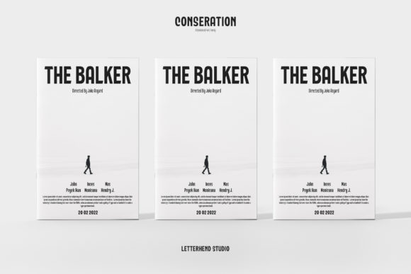
Conseration Font: Elevate Your Design with a Classy yet Playful Typeface
The world of typography is vast and diverse, with numerous font styles to choose from, each with its unique characteristics and uses. Among these, the Conseration font stands out as a versatile and stylish sans serif condensed font family. Designed to cater to a wide range of design needs, Conseration offers five distinct styles: regular, light, bold, semi, and medium. This flexibility makes it an ideal choice for projects that require a touch of luxury, class, and playfulness.
Key Features of Conseration Font
- Versatile Style Options: Conseration is not just any font; it’s a family of five styles – regular, light, bold, semi, and medium. This range allows designers to pick the perfect weight to match their project’s tone and aesthetic.
- Sans Serif Condensed Design: The font’s sans serif and condensed design makes it highly legible, even at smaller sizes. This feature is particularly useful for headings, titles, and short texts where space is limited.
- Luxury and Playfulness: What sets Conseration apart is its unique blend of luxury and playfulness. It’s classy enough for high-end branding and fun enough for creative projects that require a youthful vibe.
Ideas for Using Conseration Font
The versatility of Conseration font makes it suitable for a myriad of design projects. Here are some ideas to get you started:
📸 Preview Images


💡 Click on any image to view full size
- Branding and Logotypes: The luxury feel of Conseration makes it perfect for branding and logotypes, especially for companies that want to appear classy and sophisticated.
- Headings and Titles: Due to its condensed and sans serif design, Conseration is excellent for headings and titles, providing clear and concise text that’s easy to read.
- Packaging Design: For product packaging, Conseration can add a touch of elegance and fun, making your product stand out on the shelves.
- Digital Media: Whether it’s for a website, social media post, or digital advertisement, Conseration’s range of styles can help convey your message effectively and stylishly.
Tips for Working with Conseration Font
To make the most out of Conseration font, consider the following typography tips:
- Mix and Match: Don’t be afraid to mix different styles within the Conseration family. Using the bold style for headings and the light style for body text can create a visually appealing contrast.
- Consider Line Spacing: Especially when using the condensed style, ensure that your line spacing is adequate to maintain readability.
- Play with Colors: Conseration’s classy design looks great in a variety of colors. Experiment with different color schemes to find the one that best suits your design.
Conseration Font: Access Download Now
| Font Name | Conseration Font |
| Author | Unknown |
| Download | Access Download Here |
Conclusion
In conclusion, the Conseration font is a powerful tool for designers looking to add a touch of class and fun to their projects. Its versatility, combined with its unique design characteristics, makes it a valuable asset in any designer’s font library. Whether you’re working on a luxury brand, a creative project, or digital media, Conseration has the potential to elevate your design and make it stand out.
Final Thoughts
The world of typography is constantly evolving, with new fonts being introduced regularly. However, the Conseration font, with its blend of luxury, class, and playfulness, is sure to remain a favorite among designers for years to come. By incorporating Conseration into your design projects, you’re not just choosing a font; you’re choosing a way to communicate your message with style and sophistication.
