
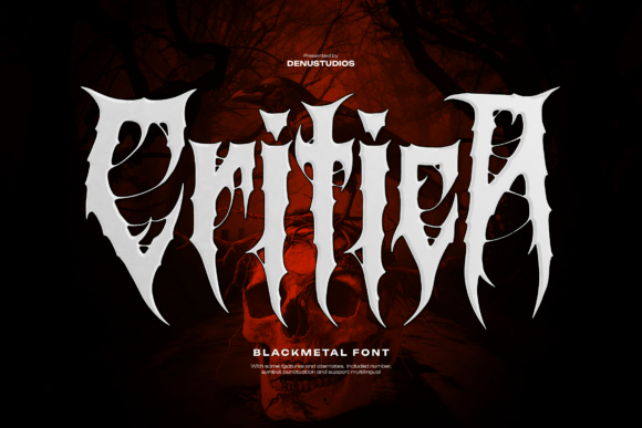
Critica Font: Unleashing the Menace of Black Metal Display Typography
The world of typography is vast and diverse, with fonts ranging from elegant serifs to bold sans-serifs. However, for those seeking a typeface that embodies the raw energy and intensity of black metal music, Critica Font stands out as a menacing and striking choice. Designed specifically for album covers, horror themes, and dark merchandise, Critica is a black metal display font that exudes an aura of darkness and rebellion.
Critica Font: A Study in Aggression
Critica Font is a masterclass in aggressive typography. Its sharp, jagged edges and haunting stylistic elements are reminiscent of the dark and foreboding atmosphere often associated with black metal music. The font’s design is characterized by:
- Sharp, jagged edges: Critica’s edges are razor-sharp, lending an air of menace to any design.
- Haunting stylistic elements: The font features intricate details that evoke a sense of eeriness and foreboding.
- Underground attitude: Critica’s design is unapologetically raw and unrefined, reflecting the rebellious spirit of black metal music.
Unleashing Critica’s Potential: Usage Examples
Critica Font is versatile and can be used in various design contexts. Here are some examples of how this menacing font can elevate your designs:
- Album covers: Critica is an excellent choice for black metal album covers, adding an air of intensity and aggression to the artwork.
- Horror themes: The font’s haunting elements make it suitable for horror-themed designs, such as movie posters, book covers, or haunted house attractions.
- Dark merchandise: Critica can be used to create eye-catching and intimidating designs for dark-themed merchandise, such as band tees, posters, or stickers.
Typography Tips for Working with Critica Font
To get the most out of Critica Font, consider the following typography tips:
- Use bold weights: Critica’s bold weights are designed to make a statement. Use them to create visually striking headlines or titles.
- Experiment with textures: Adding textures to Critica can enhance its menacing appearance. Try combining the font with rough, distressed textures to create a raw look.
- Pair with contrasting fonts: Pair Critica with a contrasting font to create visual interest. A clean, sans-serif font can provide a striking contrast to Critica’s aggressive design.
Pairing Critica with Other Fonts
While Critica Font is a powerful typeface on its own, it can be paired with other fonts to create visually striking combinations. Here are some font pairing suggestions:
- Montserrat: This clean, sans-serif font provides a striking contrast to Critica’s aggressive design.
- Playfair Display: This elegant serif font can add a touch of sophistication to designs featuring Critica.
- Impact: Pairing Critica with Impact can create a bold, high-impact look that’s perfect for attention-grabbing designs.
Critica Font: Access Download Now
| Font Name | Critica Font |
| Author | Unknown |
| Download | Access Download Here |
Conclusion
Critica Font is a menacing black metal display font that’s perfect for album covers, horror themes, and dark merchandise. Its sharp, jagged edges and haunting stylistic elements make it a standout typeface that’s sure to grab attention. By following typography tips and experimenting with font pairings, designers can unlock Critica’s full potential and create striking designs that scream intensity and underground attitude.
