
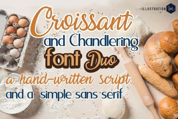
Croissant and Chandlering Duo Font: The Perfect Pairing for Cozy and Professional Branding
In the world of typography, finding the perfect font duo can be a daunting task. However, when it comes to creating a warm and inviting brand identity, the Croissant and Chandlering Duo Font stands out from the rest. This charming pairing blends a warm handwritten script with a clean, simple sans serif, making it ideal for bakery branding, food blogs, recipe cards, and café menus.
Croissant: The Warm and Inviting Script Font
The Croissant script font is designed to flow like icing on a fresh pastry. Its warm and inviting strokes evoke a sense of coziness and homeliness, perfect for brands that want to convey a sense of handcrafted quality. The fluid lines and curves of Croissant create a beautiful, organic feel that is sure to capture the attention of your audience.

Chandlering: The Clean and Modern Sans Serif Font
Chandlering, on the other hand, is a clean and modern sans serif font that adds clarity and contrast to the Croissant script. Its neat and simple design makes it perfect for creating a professional finish, while its modern appeal ensures that your brand looks contemporary and fresh. Chandlering is ideal for use in headings, titles, and short paragraphs of text.

The Perfect Pairing: Croissant and Chandlering
When used together, Croissant and Chandlering create a beautiful and harmonious pairing that is sure to elevate your brand identity. The warm and inviting strokes of Croissant complement the clean and modern design of Chandlering, creating a unique and eye-catching visual effect. This pairing is perfect for:
- Bakery branding: Create a warm and inviting brand identity for your bakery with Croissant and Chandlering.
- Food blogs: Use Croissant and Chandlering to create a cozy and professional look for your food blog.
- Recipe cards: Add a touch of elegance and sophistication to your recipe cards with this beautiful font pairing.
- Café menus: Create a warm and welcoming atmosphere for your café with Croissant and Chandlering.
Tips for Using Croissant and Chandlering
Here are some tips for using Croissant and Chandlering in your branding:
- Use Croissant as a headline font and Chandlering as a body font for a clear and readable layout.
- Use Chandlering for headings and Croissant for body text for a more playful and creative look.
- Experiment with different colors and textures to add depth and interest to your design.
- Don’t be afraid to mix and match different fonts to create a unique and eye-catching visual effect.
The Benefits of Using Croissant and Chandlering
So why choose Croissant and Chandlering for your branding needs? Here are just a few benefits of using this beautiful font pairing:
- Warm and inviting: Croissant and Chandlering create a warm and inviting atmosphere that is sure to capture the attention of your audience.
- Professional finish: Chandlering adds a professional finish to your branding, while Croissant adds a touch of elegance and sophistication.
- Versatile: This font pairing is versatile and can be used in a variety of contexts, from bakery branding to food blogs.
- Easy to read: Croissant and Chandlering are easy to read, even at small sizes, making them perfect for use in body text.
Croissant and Chandlering Duo Font: Access Download Now
| Font Name | Croissant and Chandlering Duo Font |
| Author | Unknown |
| Download | Access Download Here |
Conclusion
In conclusion, Croissant and Chandlering Duo Font is a charming and deliciously styled font pairing that is perfect for creating a warm and inviting brand identity. With its warm handwritten script and clean, simple sans serif, this pairing is ideal for bakery branding, food blogs, recipe cards, and café menus. Whether used together or separately, Croissant and Chandlering are sure to elevate your branding and add a touch of elegance and sophistication to your design.
