
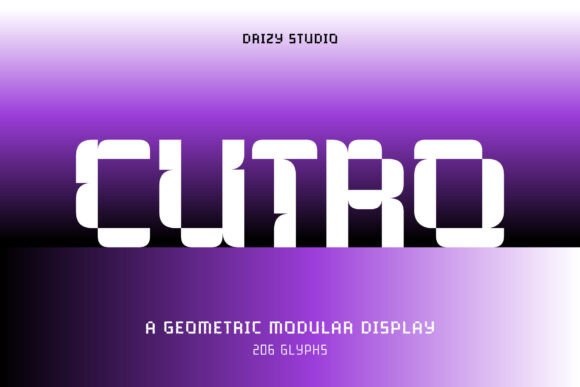
Cutro Font: A Bold Exploration of Symmetry and Structure
Cutro font is a revolutionary typeface that embodies the perfect blend of symmetry, structure, and geometric precision. As a member of the Wide Modular Font family, Cutro boasts a striking, expansive style that commands attention and makes a lasting impression. In this article, we’ll delve into the world of Cutro font, exploring its unique features, design inspiration, and versatility in various design applications.
Geometric Precision and Modular Design
Cutro’s design is rooted in geometric precision, with each letterform carefully crafted using modular shapes. This approach results in a highly distinctive and futuristic look that’s perfect for logos, posters, tech branding, and avant-garde projects. The font’s modular design ensures that every character is constructed from basic shapes, creating a cohesive and harmonious visual identity.
📸 Preview Images


💡 Click on any image to view full size

A Bold Exploration of Symmetry and Structure
Cutro’s design inspiration stems from the concept of symmetry and structure. The font’s wide stance and clean construction create a sense of balance and stability, making it perfect for designs that require a strong visual presence. The font’s geometric shapes and modular design elements work in harmony to create a truly unique and captivating visual experience.
Versatility in Design Applications
Cutro font is an incredibly versatile typeface, suitable for a wide range of design applications. Its striking, expansive style makes it perfect for:
- Logos: Create a lasting impression with Cutro’s bold, geometric design.
- Posters: Grab attention with Cutro’s expansive style and modular design.
- Tech Branding: Establish a strong visual identity with Cutro’s futuristic look.
- Avant-Garde Projects: Push the boundaries of design with Cutro’s unique and captivating style.
Digital Interfaces and Print Design
Cutro font is designed to excel in both digital interfaces and print design. Its clean construction and geometric precision ensure that it remains legible and visually appealing, even at small sizes. Whether you’re designing for:
- Web applications
- Mobile apps
- Print materials (brochures, flyers, posters)
Cutro font delivers a visual impact that’s impossible to ignore.
Typography Tips for Using Cutro Font
To get the most out of Cutro font, consider the following typography tips:
- Use Cutro font as a headline or title font to grab attention.
- Pair Cutro font with a sans-serif font for body text to create visual contrast.
- Experiment with different font sizes and colors to create visual hierarchy.
The Benefits of Using Cutro Font
Cutro font offers a range of benefits for designers, including:
- Unique and distinctive visual identity
- Highly legible and readable
- Versatile and adaptable design
- Perfect for designs that require a strong visual presence
Cutro Font: Access Download Now
| Font Name | Cutro Font |
| Author | Unknown |
| Download | Access Download Here |
Conclusion
Cutro font is a bold and innovative typeface that embodies the perfect blend of symmetry, structure, and geometric precision. Its unique design, versatility, and strong visual presence make it perfect for a wide range of design applications. Whether you’re designing for digital interfaces or bold print pieces, Cutro font delivers a visual impact that’s impossible to ignore.
