
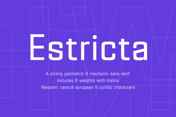
Estricta Family Font: A Geometrical and Mechanic Sans-Serif Typeface
The Estricta font family, designed by Pablo Balcells in 2017 for Graviton Font Foundry, is a sans-serif typeface that boasts a geometrical and mechanic appearance. Its sharp, angular edges provide a strong and solid design, making it an excellent choice for various typography needs. In this article, we’ll delve into the features and benefits of the Estricta font family, exploring its suitability for short and middle-length text blocks, headlines, and its language support.
Design and Characteristics
The Estricta font family is characterized by its sharp, angular edges, which give it a robust and solid appearance. Its geometrical and mechanic design makes it perfect for creating a strong visual impact. The font family consists of 12 styles, each with small caps and glyph coverage for several languages. This extensive range of styles allows designers to choose the perfect variation to suit their design needs.
The Estricta font family is a sans-serif typeface, which means it doesn’t have the small lines or flourishes at the ends of the letters. This feature makes it ideal for use in digital media, such as websites, mobile apps, and electronic documents, where clarity and legibility are crucial.
Suitability for Text Blocks and Headlines
The Estricta font family has been designed to be most suitable for short and middle-length text blocks, as well as headlines of all sizes. Its clear and legible design ensures that text is easily readable, even at small font sizes. This makes it an excellent choice for body text, captions, and other written content.
For headlines, the Estricta font family offers a range of bold and striking styles that can help grab the reader’s attention. Its geometrical and mechanic design gives headlines a modern and edgy look, making it perfect for titles, headings, and other display text.
Language Support
The Estricta font family offers glyph coverage for several languages, making it a versatile and practical choice for designers working on international projects. This feature ensures that text in various languages can be set in a consistent and visually appealing way.
The font family’s language support includes, but is not limited to, Western European languages, such as English, French, German, Italian, and Spanish, among others. This extensive language support makes the Estricta font family an excellent choice for global brands, multinational companies, and designers working on projects with diverse language requirements.
Benefits for Designers and Developers
The Estricta font family offers several benefits for designers and developers. Its clear and legible design makes it easy to read, even at small font sizes, reducing eye strain and improving user experience.
The font family’s extensive range of styles and language support makes it a versatile and practical choice for designers working on various projects. Its geometrical and mechanic design gives text a modern and edgy look, making it perfect for creating visually appealing and engaging content.
For developers, the Estricta font family is easy to integrate into websites, mobile apps, and electronic documents, thanks to its compatibility with various operating systems and devices.
Estricta Family Font: Access Download Now
| Font Name | Estricta Family Font |
| Author | Unknown |
| Download | Access Download Here |
Conclusion
In conclusion, the Estricta font family is a versatile and practical sans-serif typeface designed by Pablo Balcells in 2017 for Graviton Font Foundry. Its geometrical and mechanic appearance, sharp angular edges, and extensive range of styles make it perfect for short and middle-length text blocks, headlines, and various design projects.
Its language support, compatibility with various operating systems and devices, and ease of integration make it an excellent choice for designers and developers working on international projects. If you’re looking for a strong and solid font family that can help you create visually appealing and engaging content, the Estricta font family is definitely worth considering.
Key Features:
- Geometrical and mechanic sans-serif typeface
- Sharp, angular edges for a strong and solid design
- 12 styles, including small caps and glyph coverage for several languages
- Suitable for short and middle-length text blocks, as well as headlines of all sizes
- Clear and legible design for improved readability
- Extensive language support for Western European languages and more
