
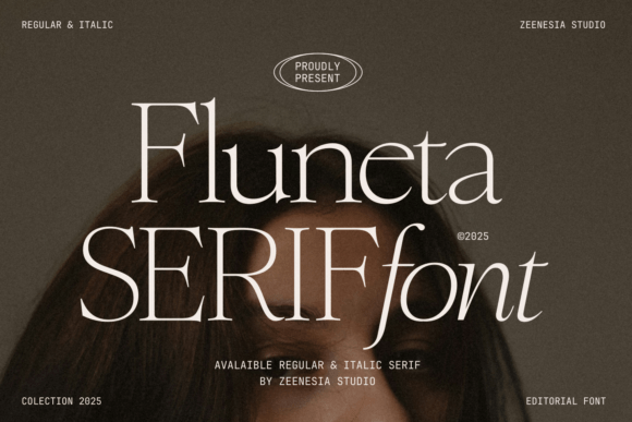
Introducing Fluneta Font: A Timeless Serif Typeface for Modern Design
In the world of typography, a well-crafted font can elevate a design from ordinary to extraordinary. Fluneta Font is a refined serif typeface that embodies the perfect blend of classic elegance and modern charm. With its sleek lines, sophisticated aesthetic, and versatile style, Fluneta is poised to become a go-to choice for designers seeking to add a touch of refinement to their projects.
Key Features of Fluneta Font
- Refined Serif Design: Fluneta boasts a classic serif design, characterized by subtle curves and precise lines that exude elegance and sophistication.
- Modern Twist: Despite its traditional roots, Fluneta features a modern charm that sets it apart from more traditional serif typefaces.
- Two-Style Family: Fluneta is available in two styles: Regular and Italic, providing designers with flexibility and versatility for their design projects.
- Multimedia Versatility: Whether you’re designing for print or digital platforms, Fluneta performs exceptionally well, ensuring clarity and readability across various mediums.
The Design Philosophy Behind Fluneta
Fluneta was designed with a clear vision: to create a typeface that seamlessly blends traditional elegance with modern sensibilities. The design process involved meticulous attention to detail, ensuring that each letterform is not only aesthetically pleasing but also highly legible. The result is a font that feels both timeless and contemporary, making it suitable for a wide range of design applications.
📸 Preview Images


💡 Click on any image to view full size
The design philosophy of Fluneta is rooted in the belief that typography should enhance, not overshadow, the content it supports. As such, Fluneta’s design emphasizes clarity, readability, and versatility, making it an excellent choice for body text, headings, and everything in between.
Applications of Fluneta Font
Fluneta’s versatility makes it an ideal choice for various design projects. Here are some of the many applications where Fluneta excels:
- Print Design: Fluneta is perfectly suited for print materials such as books, magazines, newspapers, and branding collateral. Its serif design ensures a classic look that resonates with readers.
- Digital Media: On digital platforms, Fluneta’s clarity and legibility shine through, making it a great choice for websites, blogs, and mobile applications.
- Advertising: For advertisements and marketing materials, Fluneta’s sophisticated appearance helps brands communicate their message with authority and style.
- Packaging: Product packaging benefits from Fluneta’s distinctive look, adding a layer of elegance and professionalism to product labels and packaging designs.
Typographic Details of Fluneta
Understanding the typographic details of Fluneta provides a deeper appreciation for its design and functionality. Here are some key typographic elements:
- X-Height: Fluneta features a well-proportioned x-height that contributes to its readability, especially in body text.
- Letter Spacing: The font’s letter spacing is carefully calibrated to ensure optimal legibility and aesthetics.
- Weight and Style: Available in Regular and Italic styles, Fluneta offers flexibility for designers to convey different tones and emphasis in their text.
- Kerning: Precise kerning ensures that letter combinations are visually balanced, enhancing the overall appearance of the text.
Fluneta vs. Other Serif Fonts
In a market saturated with serif typefaces, Fluneta distinguishes itself through its unique blend of classic and modern elements. Here’s how Fluneta compares to other popular serif fonts:
- Fluneta vs. Times New Roman: While Times New Roman is a classic choice, Fluneta offers a more contemporary feel and improved legibility on digital screens.
- Fluneta vs. Georgia: Georgia is known for its readability on screens, but Fluneta’s design provides a more refined and elegant appearance, suitable for high-end design projects.
- Fluneta vs. Merriweather: Merriweather is a beautiful, classic serif font. Fluneta, however, presents a more versatile option with its modern charm and extensive legibility.
How to Use Fluneta Font Effectively
To maximize the potential of Fluneta, consider the following tips:
- Pairing with Other Fonts: Combine Fluneta with sans-serif fonts for contrast or with other serif fonts for harmony, ensuring your design remains cohesive.
- Choosing the Right Size: For body text, use Fluneta at a minimum of 10-12pt for print and 14-16px for digital to ensure readability.
- Utilizing Italics: The Italic style of Fluneta can be used to add emphasis, differentiate sections, or highlight quotes.
Fluneta Font: Access Download Now
| Font Name | Fluneta Font |
| Author | Unknown |
| Download | Access Download Here |
Conclusion
Fluneta Font stands out as a sophisticated and versatile serif typeface, capable of elevating a wide range of design projects. Its blend of classic elegance and modern charm, combined with its focus on readability and clarity, makes Fluneta an excellent choice for designers worldwide. Whether you’re working on print materials, digital content, or advertising, Fluneta is poised to bring a touch of refinement and professionalism to your designs.
