
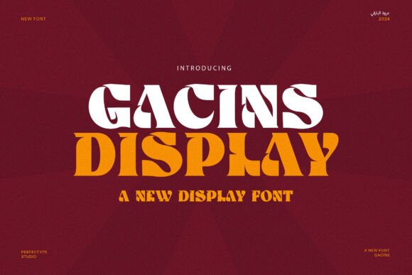
Gacins Font: Elevate Your Design with Vintage Elegance and Timeless Charm
In the world of typography, fonts play a crucial role in shaping the visual identity of a brand or design project. Among the numerous typefaces available, the Gacins Font stands out for its unique blend of vintage elegance and classic charm. Specifically, the Gacins Display Serif Font is a bold and striking typeface designed to bring a sense of sophistication and timeless appeal to any design. With its distinctive serif features, this font exudes a sense of nostalgia while maintaining a fresh, modern look.
The Distinctive Features of Gacins Display Serif Font
The Gacins font’s vintage style is characterized by its sharp serifs and balanced proportions, making it highly legible yet full of character. Its strong, confident structure ensures that every letter stands out, whether it’s used in headlines, logos, or product branding. The font’s bold presence captures attention, while its refined vintage elements add sophistication to any design. These features make Gacins Display Serif Font perfect for a wide range of creative projects, from logos and branding to websites, magazines, and product packaging.
📸 Preview Images


💡 Click on any image to view full size
Versatility in Design Applications
One of the key advantages of the Gacins font is its versatility. It is suitable for various design applications, making it a valuable asset for designers. Whether you’re working on boutique designs, food packaging, or retro-inspired projects, Gacins provides the perfect type solution. Its unique blend of elegance and strength makes it ideal for editorial layouts, offering a sophisticated and powerful visual presence.
In branding and marketing, the Gacins font plays a crucial role in creating a lasting impression. Its bold and striking appearance ensures that it captures attention, while its vintage elements evoke a sense of nostalgia and classic charm. For product packaging, the font’s legibility and character make it an excellent choice, ensuring that the product stands out on store shelves.
Elegance and Strength in Editorial Layouts
Beyond branding and marketing, the Gacins Display Serif Font is a fantastic choice for editorial layouts. Its blend of elegance and strength makes it perfect for magazines, newspapers, and other publications. The font’s bold presence ensures that it captures attention, while its refined vintage elements add sophistication to any design. Whether you’re designing a fashion magazine, a food blog, or a lifestyle publication, Gacins provides the perfect type solution.
In editorial design, the font’s legibility and character are essential in creating a visually appealing layout. The Gacins font’s balanced proportions and sharp serifs make it easy to read, even in small sizes. Its versatility also allows designers to experiment with different layouts and typography styles, creating a unique and captivating visual experience.
Why Choose Gacins Font?
There are several reasons why designers should consider the Gacins font for their next project. Firstly, its unique blend of vintage elegance and classic charm makes it stand out from other typefaces. The font’s bold and striking appearance ensures that it captures attention, while its refined vintage elements add sophistication to any design.
Secondly, the Gacins font is highly versatile, making it suitable for various design applications. Whether you’re working on branding, marketing, editorial design, or product packaging, Gacins provides the perfect type solution. Its legibility and character make it an excellent choice for a wide range of creative projects.
Lastly, the Gacins font is designed to create a lasting impression. Its timeless appeal ensures that it remains relevant, even as design trends evolve. By choosing Gacins, designers can create powerful, timeless visuals that leave a lasting impression on their audience.
Gacins Font: Access Download Now
| Font Name | Gacins Font |
| Author | Unknown |
| Download | Access Download Here |
Conclusion
In conclusion, the Gacins Display Serif Font is a bold and striking typeface that brings a sense of vintage elegance and classic charm to any design. Its distinctive serif features, sharp serifs, and balanced proportions make it highly legible, yet full of character. With its versatility and unique style, Gacins is the ideal font for designers looking to create powerful, timeless visuals that leave a lasting impression.
Whether you’re working on branding, marketing, editorial design, or product packaging, the Gacins font provides the perfect type solution. Its blend of elegance and strength makes it perfect for a wide range of creative projects. By choosing Gacins, designers can elevate their design and create a lasting impression on their audience.
Key Features of Gacins Font
- Vintage Elegance: Gacins font boasts a classic, timeless appeal that adds sophistication to any design.
- Distinctive Serif Features: The font’s sharp serifs and balanced proportions make it highly legible and full of character.
- Versatility: Suitable for various design applications, including branding, marketing, editorial design, and product packaging.
- Elegance and Strength: Gacins font combines elegance and strength, making it perfect for creating powerful, timeless visuals.
- Timeless Appeal: The font’s vintage style ensures that it remains relevant, even as design trends evolve.
Design Applications of Gacins Font
- Branding and Marketing: Use Gacins font to create bold and striking logos, product packaging, and advertisements.
- Editorial Design: Perfect for magazines, newspapers, and other publications that require a sophisticated and elegant typography.
- Product Packaging: Gacins font is ideal for product packaging that requires a bold and attention-grabbing typography.
- Websites: Use Gacins font to create a unique and captivating visual experience for your website.
