
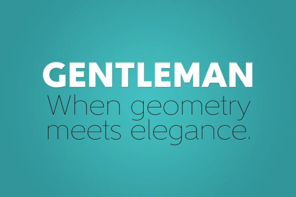
Gentleman Font: A Geometric Sans Serif Typeface with a Touch of Elegance
The Gentleman font family, designed by Juraj Chrastina, is a geometric sans serif typeface that exudes elegance and sophistication. With its ten styles, this font family is perfect for a wide range of design projects, from branding and advertising to digital media and publishing. In this article, we’ll explore the design process behind Gentleman, its unique features, and what makes it an excellent choice for designers.
The Inspiration Behind Gentleman
For Juraj Chrastina, the journey to creating Gentleman began with a fascination for geometric typefaces. Unlike modern proportions types with a plain appearance, geometric typefaces possess a certain dynamism and depth that Chrastina found captivating. He wanted to create a font that would retain these qualities while addressing the concerns of legibility and friendliness.
Design Philosophy
Chrastina’s design philosophy for Gentleman was centered around elementary forms of geometry. He aimed to create a font that would be based on simple, geometric shapes while still conveying a sense of warmth and personality. To achieve this, he introduced subtle decorative distractions that would enrich the design without compromising its simplicity.
Key Features of Gentleman
So, what sets Gentleman apart from other sans serif fonts? Here are a few distinctive elements:
- The uppercase G has no bar, giving it a unique and stylish look.
- The letters a, d, l, and p feature outstroke terminals, adding a touch of elegance.
- The double-story design allows for more creativity and flexibility.
Legibility and Friendliness
One of the biggest challenges in designing a geometric sans serif font is ensuring legibility and friendliness. Chrastina addressed this by incorporating a generous x-height, which is constant throughout the family. This design choice increased legibility and allowed for a low-contrast construction, even for thicker weights.
The Gentleman Family
Gentleman comes in 10 weights, ranging from hairline to black. Each font is equipped with carefully fine-tuned kerning tables, ensuring that the text looks great in any context. Whether you’re designing a website, a brochure, or a social media campaign, Gentleman has a weight that will suit your needs.
Why Choose Gentleman?
So, why should you choose Gentleman for your design projects? Here are a few compelling reasons:
- Elegance and sophistication: Gentleman exudes elegance and sophistication, making it perfect for high-end brands and luxury products.
- Legibility and readability: The font’s design ensures excellent legibility and readability, even in small sizes.
- Flexibility: With 10 weights to choose from, Gentleman can be used for a wide range of design projects.
- Geometric simplicity: The font’s geometric simplicity makes it easy to pair with other fonts and design elements.
Gentleman Font: Access Download Now
| Font Name | Gentleman Font |
| Author | Unknown |
| Download | Access Download Here |
Conclusion
In conclusion, Gentleman is a versatile and elegant sans serif font family that is perfect for designers looking for a geometric typeface with a touch of sophistication. Its unique features, excellent legibility, and flexibility make it an excellent choice for a wide range of design projects. Whether you’re designing a website, a brand identity, or a marketing campaign, Gentleman is sure to impress.
