
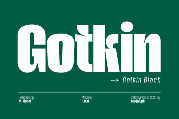
Introducing Gotkin Black Font: The Epitome of Modern Strength and Sophistication
In the realm of typography, the right font can make all the difference in conveying the intended message and aesthetic of a brand or design project. Among the myriad of font families available, Gotkin stands out as a beacon of modern strength and dynamism, thanks to its unique blend of soft curves and bold geometric lines. Specifically, the Gotkin Black Font, as part of this versatile family, offers an unparalleled level of sophistication and power, making it an ideal choice for a wide range of applications, from corporate branding and digital interfaces to editorial designs.
The Design Philosophy Behind Gotkin
Gotkin’s design philosophy revolves around striking a delicate balance between warmth and boldness. This is achieved through its characteristic soft curves that add a touch of elegance and approachability, while its bold geometric lines inject a sense of strength and modernity. The result is a font family that is not only visually appealing but also highly functional across various mediums.
📸 Preview Images


💡 Click on any image to view full size
Versatility at Its Core
One of the standout features of the Gotkin font family, including the Gotkin Black Font, is its extensive range of weights, from light to black. This versatility allows designers to employ the font across a spectrum of design needs, ensuring consistency and flexibility. Whether it’s for creating impactful headlines or readable body text, Gotkin offers a solution that caters to all typographic requirements.
Key Features of Gotkin Font Family:
- Extensive Weight Range: From light to black, allowing for a wide range of applications.
- Beautiful Italics: Adding an extra layer of elegance and expressiveness to the font.
- Excellent Weights: Ensuring readability and aesthetic appeal across different use cases.
- Alternates, Ligatures, and Extensive Language Support: Providing designers with the tools to create unique and inclusive designs.
Clean Lines and Readability
Gotkin’s design emphasizes clean lines, a feature that significantly enhances readability across all formats. This aspect is particularly crucial in today’s digital age, where content is consumed on various devices and platforms. The clean lines ensure that whether Gotkin is used for headlines or body text, it remains clear and legible, making it a versatile solution for professionals seeking both clarity and style.
The Power of Variable Font Version
Understanding the needs of modern designers, Gotkin also comes with a variable font version. This feature allows designers to explore a wide range of weights and styles within a single font file, streamlining the design process and offering greater flexibility to refine and perfect their creations.
Gotkin in Display Settings
While Gotkin excels in a variety of applications, it particularly shines in display settings. Its bold and sophisticated appearance makes it an excellent choice for:
- Headlines and Titles: Capturing attention with its modern strength.
- Branding Projects and Logo Designs: Conveying a sense of dynamism and sophistication.
- Packaging and Magazine Titles: Adding a touch of elegance and boldness.
- Advertisements: Standing out with its unique blend of curves and geometric lines.
- Short or Long Texts: Maintaining readability and aesthetic appeal.
Gotkin Black Font: Access Download Now
| Font Name | Gotkin Black Font |
| Author | Unknown |
| Download | Access Download Here |
Conclusion
The Gotkin Black Font, as part of the Gotkin font family, represents the pinnacle of modern typographic design, offering a perfect blend of strength, sophistication, and versatility. Its design philosophy, characterized by soft curves and bold geometric lines, along with its extensive range of features, makes it an invaluable asset for designers and brands aiming to make a lasting impression. Whether for corporate branding, digital interfaces, editorial designs, or display settings, Gotkin is poised to elevate any project with its clarity, style, and dynamism.
Final Thoughts
In the quest for the perfect font, Gotkin emerges as a strong contender, capable of meeting the diverse needs of contemporary design. Its ability to convey modern strength and sophistication, coupled with its readability and versatility, positions Gotkin as a go-to font family for professionals seeking to create impactful and aesthetically pleasing designs.
