
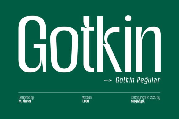
Introducing Gotkin Font: The Epitome of Modern Strength and Sophistication
In the realm of typography, fonts play a pivotal role in conveying messages, evoking emotions, and establishing brand identities. Among the myriad of fonts available, Gotkin stands out as a beacon of modern strength and dynamism. This comprehensive article delves into the world of Gotkin, a strong and sophisticated sans serif font family that has been making waves in the design community.
The Design Philosophy of Gotkin
Gotkin is designed with a clear vision: to blend soft curves with bold geometric shapes. This unique combination adds a layer of warmth to the font, making it not only bold but also approachable. The design philosophy of Gotkin revolves around creating a balance between modernity and readability. Its clean lines and carefully crafted letterforms ensure that it stands out in any medium, from digital interfaces to print.
📸 Preview Images


💡 Click on any image to view full size
Versatility at Its Core
One of the key features of Gotkin is its versatility. This font family is not limited to a specific use case; instead, it offers a wide range of applications. Whether it’s corporate branding, digital interfaces, or editorial designs, Gotkin proves to be an ideal choice. Its clean and clear design ensures readability across various formats, from headlines to body text, making it a go-to solution for professionals seeking both clarity and style.
Exceling in Display Settings
Gotkin truly excels in display settings, making it perfect for headlines, titles, branding projects, logo designs, packaging, magazine titles, and advertisements. Its bold and geometric shapes, combined with soft curves, make it a powerful tool for grabbing attention. Whether it’s a short phrase or a long text, Gotkin maintains its readability and aesthetic appeal, ensuring that the message is conveyed effectively.
Applications of Gotkin
The applications of Gotkin are vast and varied. Here are some of the key areas where Gotkin shines:
- Corporate Branding: Gotkin’s modern and sophisticated look makes it an excellent choice for corporate branding. Its boldness and warmth can help establish a strong brand identity.
- Digital Interfaces: The font’s readability on digital platforms makes it suitable for websites, mobile apps, and other digital interfaces.
- Editorial Designs: For magazines, newspapers, and editorial content, Gotkin offers a clean and modern look that enhances readability and visual appeal.
- Logo Designs: The unique combination of soft curves and bold geometric shapes makes Gotkin an excellent choice for logo designs that require both modernity and approachability.
- Packaging: Gotkin’s bold and eye-catching design makes it suitable for product packaging, helping brands stand out on the shelves.
The Benefits of Using Gotkin
Choosing Gotkin for your design projects comes with numerous benefits:
- Modern Aesthetic: Gotkin provides a modern and fresh look that can elevate the visual appeal of any project.
- Readability: Its clean design ensures high readability, even in smaller sizes.
- Versatility: Gotkin can be used across various mediums and applications, making it a versatile addition to any designer’s toolkit.
- Brand Differentiation: With Gotkin, brands can establish a unique and memorable visual identity.
Gotkin Font: Access Download Now
| Font Name | Gotkin Font |
| Author | Unknown |
| Download | Access Download Here |
Conclusion
Gotkin is more than just a font; it’s a design statement. Its unique blend of modern strength, dynamism, and sophistication makes it an ideal choice for designers looking to make an impact. Whether you’re working on corporate branding, digital interfaces, or editorial designs, Gotkin offers the perfect combination of style, readability, and versatility. As the world of design continues to evolve, Gotkin stands out as a beacon of modernity and elegance, ready to elevate any project to new heights.
Frequently Asked Questions (FAQs) About Gotkin Font
Q: What makes Gotkin unique?
A: Gotkin’s unique blend of soft curves and bold geometric shapes sets it apart, offering both warmth and boldness.
Q: Is Gotkin suitable for digital use?
A: Yes, Gotkin is designed to be highly readable on digital platforms, making it suitable for websites, mobile apps, and more.
Q: Can Gotkin be used for print projects?
A: Absolutely, Gotkin’s clean and bold design makes it an excellent choice for print projects, including magazines, newspapers, and packaging.
Q: Is Gotkin a versatile font?
A: Yes, Gotkin’s versatility is one of its key features, allowing it to be used across a wide range of applications and mediums.
