
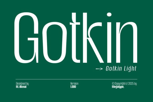
Introducing Gotkin Light Font: The Epitome of Modern Strength and Sophistication
In the realm of typography, fonts play a pivotal role in conveying messages, evoking emotions, and establishing brand identities. Among the myriad of fonts available, Gotkin stands out as a beacon of modern strength and dynamism, thanks to its unique blend of soft curves and bold geometric lines. Specifically, the Gotkin Light Font has garnered attention for its versatility, readability, and aesthetic appeal, making it an ideal choice for a wide range of design applications.
Design Characteristics of Gotkin Light Font
Gotkin is a sans serif font family that has been meticulously designed to exude a sense of sophistication and modernity. Its design is characterized by soft curves that add a touch of warmth to its bold geometric structure. This combination ensures that Gotkin strikes a perfect balance between being bold and approachable, making it highly versatile for various design needs.
📸 Preview Images


💡 Click on any image to view full size
One of the standout features of Gotkin is its clean lines, which ensure exceptional readability across different formats, from headlines to body text. This aspect is particularly beneficial for professionals who seek clarity and style in their designs. Whether it’s for corporate branding, digital interfaces, or editorial designs, Gotkin offers a solution that is both aesthetically pleasing and highly functional.
Applications of Gotkin Light Font
Gotkin Light Font, with its unique design attributes, excels in display settings, making it an excellent choice for headlines, titles, branding projects, logo designs, packaging, magazine titles, and advertisements. Its ability to convey modern strength and dynamism, coupled with its warm and bold appearance, makes it suitable for both short and long texts.
In corporate branding, Gotkin helps in creating a strong and sophisticated visual identity. Its modern appeal can significantly enhance a brand’s image, making it more relatable and engaging to the target audience.
For digital interfaces, the font’s clean lines and readability ensure a seamless user experience. Its versatility allows it to be used in various digital platforms, from websites to mobile apps, providing a consistent and professional look.
In editorial designs, Gotkin brings a level of sophistication and elegance. Its use in magazines, newspapers, and digital publications can elevate the reading experience, making the content more engaging and visually appealing.
The Versatility of Gotkin Light Font
The versatility of Gotkin Light Font lies in its ability to be used across a spectrum of design projects. Its design ensures that it can be scaled up or down without compromising on readability or aesthetic appeal. This makes it a valuable asset for designers who work on a wide range of projects, from large-scale branding campaigns to smaller, detailed design elements.
Moreover, Gotkin’s compatibility with various design software and platforms ensures that designers can easily integrate it into their workflow. Whether you’re working on a print project, a digital interface, or a branding campaign, Gotkin can be seamlessly incorporated to elevate the visual appeal and impact of your design.
Why Choose Gotkin Light Font?
Choosing Gotkin Light Font for your design projects comes with several benefits:
- Modern Appeal: Gotkin’s design captures the essence of modern strength and dynamism, making it perfect for brands and projects that aim to appear contemporary and forward-thinking.
- Versatility: Its suitability for a wide range of design applications, from headlines to body text, makes it a versatile addition to any designer’s toolkit.
- Readability: The font’s clean lines and well-thought-out design ensure high readability, even at smaller sizes.
- Aesthetic Balance: Gotkin strikes a perfect balance between boldness and warmth, making it suitable for designs that require both impact and approachability.
Gotkin Light Font: Access Download Now
| Font Name | Gotkin Light Font |
| Author | Unknown |
| Download | Access Download Here |
Conclusion
Gotkin Light Font represents a fusion of modern strength, sophistication, and versatility, making it an excellent choice for designers and brands looking to make a statement. Its unique design characteristics, coupled with its wide range of applications, position Gotkin as a go-to font for various design needs. Whether you’re working on corporate branding, digital interfaces, or editorial designs, Gotkin Light Font offers a solution that combines clarity, style, and impact.
Future of Typography with Gotkin Light Font
The future of typography is constantly evolving, with new trends and technologies emerging regularly. Fonts like Gotkin Light are at the forefront of this evolution, offering a glimpse into how typography can be both functional and aesthetically pleasing. As design continues to play a crucial role in communication and brand identity, fonts that can adapt, convey the right message, and enhance visual appeal will be highly valued.
In this context, Gotkin Light Font not only meets the current demands of designers and brands but also sets a precedent for future typography trends. Its blend of modernity, versatility, and readability positions it as a font that can adapt to the changing needs of the design world, making it a valuable resource for professionals seeking to create impactful and engaging designs.
