
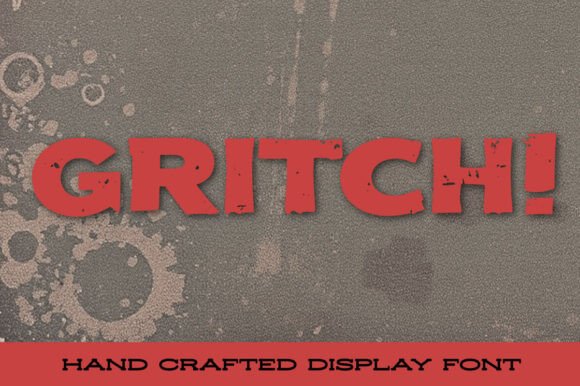
Gritch Font: Unleashing the Raw Power of Grunge
In the world of typography, few fonts have managed to capture the essence of grunge as perfectly as Gritch. This raw, rugged, and unapologetically distressed font has been making waves in the design community, and for good reason. With its rough edges, eroded textures, and worn-down letterforms, Gritch feels like it’s been scraped, scratched, and weathered over time. In this article, we’ll dive into the world of Gritch Font, exploring its unique characteristics, uses, and the impact it can have on your designs.
The Essence of Grunge: A Brief Introduction
Before we dive into the specifics of Gritch Font, it’s essential to understand the grunge aesthetic. Emerging in the late 1980s and early 1990s, grunge was a cultural and musical movement characterized by its DIY ethos, flannel shirts, and ripped jeans. In the world of design, grunge translates to a bold, distressed, and rebellious visual language. It’s about embracing the imperfect, the rough, and the unpolished.
📸 Preview Images


💡 Click on any image to view full size
Gritch Font: A Perfect Embodiment of Grunge
Gritch Font is the perfect embodiment of the grunge aesthetic. With its rough, distressed texture and worn-down letterforms, it’s like a visual representation of a punk rock anthem. The font’s edges are rough, its lines are shaky, and its overall appearance is one of utter rebellion. When you use Gritch, you’re not just using a font – you’re making a statement.
Characteristics of Gritch Font
So, what makes Gritch Font so unique? Here are a few of its standout characteristics:
- Rough Edges: Gritch’s edges are rough, uneven, and utterly authentic. They look like they’ve been scraped, scratched, or even bitten.
- Eroded Textures: The font’s textures are worn, weathered, and eroded. They look like they’ve been exposed to the elements for years.
- Worn-Down Letterforms: Gritch’s letterforms are worn down, with rough, uneven lines and a general air of fatigue.
- Distressed Appearance: The font’s overall appearance is one of distress, like it’s been through a war and come out battered and bruised.
Uses of Gritch Font
Gritch Font is perfect for any design project that demands a bold, gritty aesthetic. Here are a few ideas to get you started:
- Punk Rock Posters: Gritch is a natural fit for punk rock posters, adding a raw, rebellious energy to your designs.
- Vintage-Inspired Logos: The font’s distressed appearance makes it perfect for vintage-inspired logos that need a bit of grit and attitude.
- Edgy Apparel Design: Gritch is a great choice for apparel design, adding a bold, eye-catching element to t-shirts, hoodies, and more.
- Bold Headlines: The font’s bold, rugged appearance makes it perfect for headlines that need to pack a punch.
Tips for Using Gritch Font
While Gritch Font is incredibly versatile, there are a few things to keep in mind when using it:
- Use it Sparingly: Gritch is a bold font, and using it too much can be overwhelming. Use it sparingly to add emphasis and impact.
- Pair it with Contrasts: Gritch pairs well with clean, simple fonts that provide a nice contrast to its distressed appearance.
- Experiment with Colors: Gritch looks great in bold, bright colors, but it can also work well in more muted, earthy tones.
Gritch Font: Access Download Now
| Font Name | Gritch Font |
| Author | Unknown |
| Download | Access Download Here |
Conclusion
Gritch Font is a raw, rugged, and unapologetically distressed font that’s perfect for designers who want to add a bit of grit and attitude to their work. With its rough edges, eroded textures, and worn-down letterforms, Gritch is the ultimate grunge font. Whether you’re crafting a punk rock poster, a vintage-inspired logo, or an edgy apparel design, Gritch delivers a powerful punch of grunge authenticity. So why settle for a boring, run-of-the-mill font when you can unleash the raw power of Gritch?
